SaaS applications are becoming increasingly popular. Ensuring responsiveness across various screen sizes can be daunting for developers who are venturing into this domain. Responsiveness is crucial as it guarantees a seamless viewing and interaction experience from desktops to smartphones. Moreover, it boosts user engagement and accessibility, and significantly, search engines prioritize mobile-optimized sites, as evidenced by search engine ranking criteria.
Given these challenges, building an application from the ground up can be time-consuming. Instead, relying on a third-party component library can speed up your development process. Chakra UI is one of the most popular React component libraries. It is a simple, modular, and accessible component library with over 34 thousand stars on GitHub, and popular websites like Udacity and Ethereum use this to power the frontend of their applications.
Here's what makes Chakra UI stand out:
- Accessibility: Chakra UI follows the WAI-ARIA standards for accessibility
- Theming: You can customize any component depending on your needs
- Dark Mode Support: The components already support dark mode, so you don't have to spend more time coding your dark mode explicitly.
The aim of the article is to help you build responsive components with Chakra UI for your SaaS app.
Building Responsive SaaS App
As mentioned in the introduction of the article, you'll be building various components that can be integrated into a SaaS application. Chakra UI will be used as the component library for building the various components. When working with Chakra UI, the components are often already responsive. If not, Chakra UI provides specific props and APIs to make them responsive to your needs. Let's understand how responsiveness works in Chakra UI.
Responsiveness in Chakra UI
Chakra UI follows the styled-system specification approach, and following this approach, you can define custom breakpoints and set responsiveness according to your needs. You can use array and object notations to define styles for different breakpoints, making it easy to create responsive designs. Chakra UI also comes with a default set of breakpoints, but these can be customized according to your application's needs. The default breakpoints are defined as:
- sm: 30em or 480px
- md: 48em or 768px
- lg: 62em or 992px
- xl: 80em or 1280px
- 2xl: 96em or 1536px
The component library allows you to specify your breakpoints in either array notation or object notation. In array notation, each value in the array corresponds to a breakpoint. For example, px={[4, 6, 8]} will set the styling as following:
- On sm, padding is 4.
- On md, padding is 6.
- On lg and up, padding is 8.
Alternatively, you can use object notation to specify styles for specific breakpoints. In this case, you can define custom styles according to the breakpoints like this px={{ base: 4, md: 6, lg: 8 }}, which will result in:
- By default (or base), padding is 4.
- On md, padding is 6.
- On lg and up, padding is 8.
The library also offers the useBreakpointValue and useMediaQuery hooks that return values or booleans based on the current window width, allowing you to create more dynamic and responsive behaviours in your components. And, if the default breakpoints do not fit your needs, you can define your own breakpoints using the ThemeProvider. This allows you to create a custom theme and set your preferred breakpoints, which can then be used throughout your application.
Now that you know how you can create responsive layouts in Chakra UI, let's write some code. But before jumping into the code, please ensure that you have basic knowledge of Next.js, and Typescript, and also, you should be familiar with Node.js and NPM.
If you are familiar with the prerequisites for the article, let's move on to setting up the project.
Setting Up Chakra UI for Next.js
As mentioned earlier, the preferred framework for this article will be Next.js. Next.js is a React framework that enables you to build full-stack web applications easily. To scaffold a new Next.js project, run the following command in your terminal:
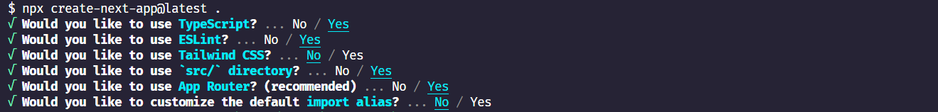
npx create-next-app@latest
Running the above will ask you for the preferences you want to set up for the project. You can choose them according to the following image, or you can choose according to your choice:
Once the scaffolding process is done, it's time to install the necessary Chakra UI packages. Paste the following command in the terminal to install the required packages:
npm i @chakra-ui/react @chakra-ui/next-js @emotion/react @emotion/styled framer-motion
Let's understand the packages used here:
- @chakra-ui/react: The core package of Chakra UI for React.
- @chakra-ui/next-js: Ensures seamless integration of Chakra UI in Next.js projects, making it compatible with server-side rendering and other Next.js-specific features.
- @emotion/styled and @emotion/react: Chakra UI is built on top of Emotion. These packages allow dynamic styling and scoping for Chakra components in React. It lets developers customize components using JavaScript and props dynamically.
- framer-motion: Chakra UI uses framer-motion for its animation functionalities. Installing this ensures smooth animations and transitions within Chakra UI components.
After the installation is successful, it's time to set up the Chakra provider. Inside the app directory, create a new file called providers.tsx and paste the following code:
// app/providers.tsx
"use client";

import { CacheProvider } from "@chakra-ui/next-js";
import { ChakraProvider } from "@chakra-ui/react";

export function Providers({ children }: { children: React.ReactNode }) {
  return (
    <CacheProvider>
      <ChakraProvider>{children}</ChakraProvider>
    </CacheProvider>
  );
}
Now, in the Layout.tsx file of your root directory, import and render it like the following:
import "./globals.css";
import { Providers } from "./providers";

export default function RootLayout({
  children,
}: {
  children: React.ReactNode,
}) {
  return (
    <html lang="en">
      <body>
        <Providers>{children}</Providers>
      </body>
    </html>
  );
}
You are now ready to code your first component with Chakra UI.
Building a Responsive App Shell with Chakra UI
A common component in almost all SaaS applications is an app shell. This shell works as a layout for the whole app. It consists of a navigation bar, a header, and a section for the child elements. Let's start by creating a new file called AppShell.tsx inside a new folder called Components. This Components folder should be inside the src directory. Also, download this SVG image from the link and move it into your public folder. This image will be used for the hamburger icon in the mobile menu.
Now, paste the following code into this file:
"use client";

import {
  IconButton,
  Box,
  CloseButton,
  Flex,
  useColorModeValue,
  Text,
  Drawer,
  DrawerContent,
  useDisclosure,
  BoxProps,
  FlexProps,
} from "@chakra-ui/react";
import Image from "next/image";
import MenuIcon from "../../public/menu.svg";

interface LinkItemProps {
name: string;
}

interface NavItemProps extends FlexProps {
children: React.ReactNode;
}

interface MobileProps extends FlexProps {
onOpen: () => void;
}

interface SidebarProps extends BoxProps {
onClose: () => void;
}

const LinkItems: Array<LinkItemProps> = [
{ name: "Home" },
{ name: "Users" },
{ name: "Contacts" },
{ name: "Settings" },
];

const SidebarContent = ({ onClose, ...rest }: SidebarProps) => {
return (

{" "}
<Box
  transition="3s ease"
  bg={useColorModeValue("white", "gray.900")}
  borderRight="1px"
  borderRightColor={useColorModeValue("gray.200", "gray.700")}
  w={{ base: "full", md: 60 }}
  pos="fixed"
  h="full"
  {...rest}
>
  <Flex h="20" alignItems="center" mx="8" justifyContent="space-between">
    <Text fontSize="xl" fontWeight="bold">
      Awesome SaaS
    </Text>
    <CloseButton display={{ base: "flex", md: "none" }} onClick={onClose} />
  </Flex>
  {LinkItems.map((link) => (
    <NavItem key={link.name}>{link.name}</NavItem>
  ))}
</Box>
); };

const NavItem = ({ children, ...rest }: NavItemProps) => (

 <Box
 as="a"
 href="#"
 style={{ textDecoration: "none" }}
 _focus={{ boxShadow: "none" }}

>

    <Flex
      align="center"
      p="2"
      mx="4"
      borderRadius="lg"
      role="group"
      cursor="pointer"
      _hover={{ bg: "gray.600", color: "white" }}
      {...rest}
    >
      {children}
    </Flex>

  </Box>
);

const MobileNav = ({ onOpen, ...rest }: MobileProps) => (

 <Flex
 ml={{ base: 0, md: 60 }}
 px={{ base: 4, md: 4 }}
 height="20"
 alignItems="center"
 bg={useColorModeValue("white", "gray.900")}
 borderBottomWidth="1px"
 borderBottomColor={useColorModeValue("gray.200", "gray.700")}
 justifyContent={{ base: "space-between", md: "flex-end" }}
 {...rest}

>

    <Text
      display={{ base: "flex", md: "none" }}
      fontSize="2xl"
      fontWeight="bold"
      justifyContent="center"
    >
      Awesome SaaS
    </Text>
    <IconButton
      display={{ base: "flex", md: "none" }}
      onClick={onOpen}
      variant="outline"
      aria-label="open menu"
      icon={<Image src={MenuIcon} alt="menu" width="24" height="24" />}
    />

  </Flex>
);

const AppShell = ({ children }: { children: React.ReactNode }) => {
const { isOpen, onOpen, onClose } = useDisclosure();

return (

 <Box minH="100vh" bg={useColorModeValue("gray.100", "gray.900")}>
 <SidebarContent
 onClose={onClose}
 display={{ base: "none", md: "block" }}
 />
 <Drawer
 isOpen={isOpen}
 placement="left"
 onClose={onClose}
 returnFocusOnClose={false}
 onOverlayClick={onClose}
 size="full"
 >
 <DrawerContent>
 <SidebarContent onClose={onClose} />
 </DrawerContent>
 </Drawer>

      <MobileNav onOpen={onOpen} />
      <Box ml={{ base: 0, md: 60 }} p="4">
        {children}
      </Box>
    </Box>

);
};
export default AppShell;
The code might look large, but essentially, this file has four components:
- SidebarContent: Responsible for the sidebar items
- NavItem: Responsible for the navigation items
- MobileNav: For displaying the navigation on mobile
- AppShell: Consists of the above components to make it a full-fledged app shell.
Let's break down the code a bit now. Because Chakra UI cannot work as server components, it is important to use the "use client" directive to make the components client-side. The required components are imported from the @chakra-ui/react component. Also, the Next.js Image component and the hamburger image are imported. Once the imports are done, the required Typescript interfaces are created, and the menu items are defined in an array. The interfaces are as follows:
- LinkItemProps: This interface defines a shape for an object with a single property name of type string.
- NavItemProps: This interface extends FlexProps, implying it will inherit all properties that FlexProps defines. The children property expects any valid React node. By extending FlexProps, NavItemProps can be used wherever properties for a flexible box layout (Flex) are required, plus it also specifically ensures that children are passed in.
- MobileProps: Similar to NavItemProps, it also inherits all the properties of FlexProps. The onOpen property expects a function. This function takes no arguments and does not return anything (void). This will be used to handle the mobile menu open function.
- SidebarProps: This interface extends BoxProps, meaning it inherits all the properties that BoxProps defines. Similar to the onOpen property of MobileProps, this expects a function onClose with no arguments that returns nothing. This will be used for the mobile menu close function.
The array contains the menu items.
Now, let's discuss each component:
- SidebarContent Component: The sidebar header contains the text "Awesome SaaS" and a CloseButton that appears only on small screens. Each item from the LinkItems array is mapped to the NavItem component to display individual navigation links. This sidebar also has a transition effect --- the background color changes based on the current color mode (light/dark).
- NavItem Component: This component represents an individual navigation link. Each NavItem is a clickable area (cursor: pointer) and highlights (_hover) when hovered. Flexbox is used to style the item
- MobileNav Component: This navigation bar is specifically for mobile views. Otherwise, the component will not be mobile-responsive. This component also displays the title "Awesome SaaS" and an icon button for the menu icon on mobile. When the menu icon is clicked, it triggers the onOpen method passed via its props.
- AppShell Component: This is the main wrapper component. It uses Chakra UI's useDisclosure hook to control the open/close state of the sidebar drawer for mobile views. The sidebar is always visible on larger screens (md size and up) but appears as a full-screen drawer on smaller screens when the menu icon is clicked. The app's main content is wrapped in a Box and displayed to the right of the sidebar on larger screens or below the mobile navigation. Finally, the AppShell component is exported for use in other places.
Now that the AppShell component is ready, you can import this component into the layout.tsx file. Import it to the layout.tsx file and wrap your children prop with this one:
import "./globals.css";
import { Providers } from "./providers";
import AppShell from "@/Components/AppShell";

export default function RootLayout({
  children,
}: {
  children: React.ReactNode,
}) {
  return (
    <html lang="en">
      <body>
        <Providers>
          <AppShell>{children}</AppShell>
        </Providers>
      </body>
    </html>
  );
}
The application at this moment should look like this:
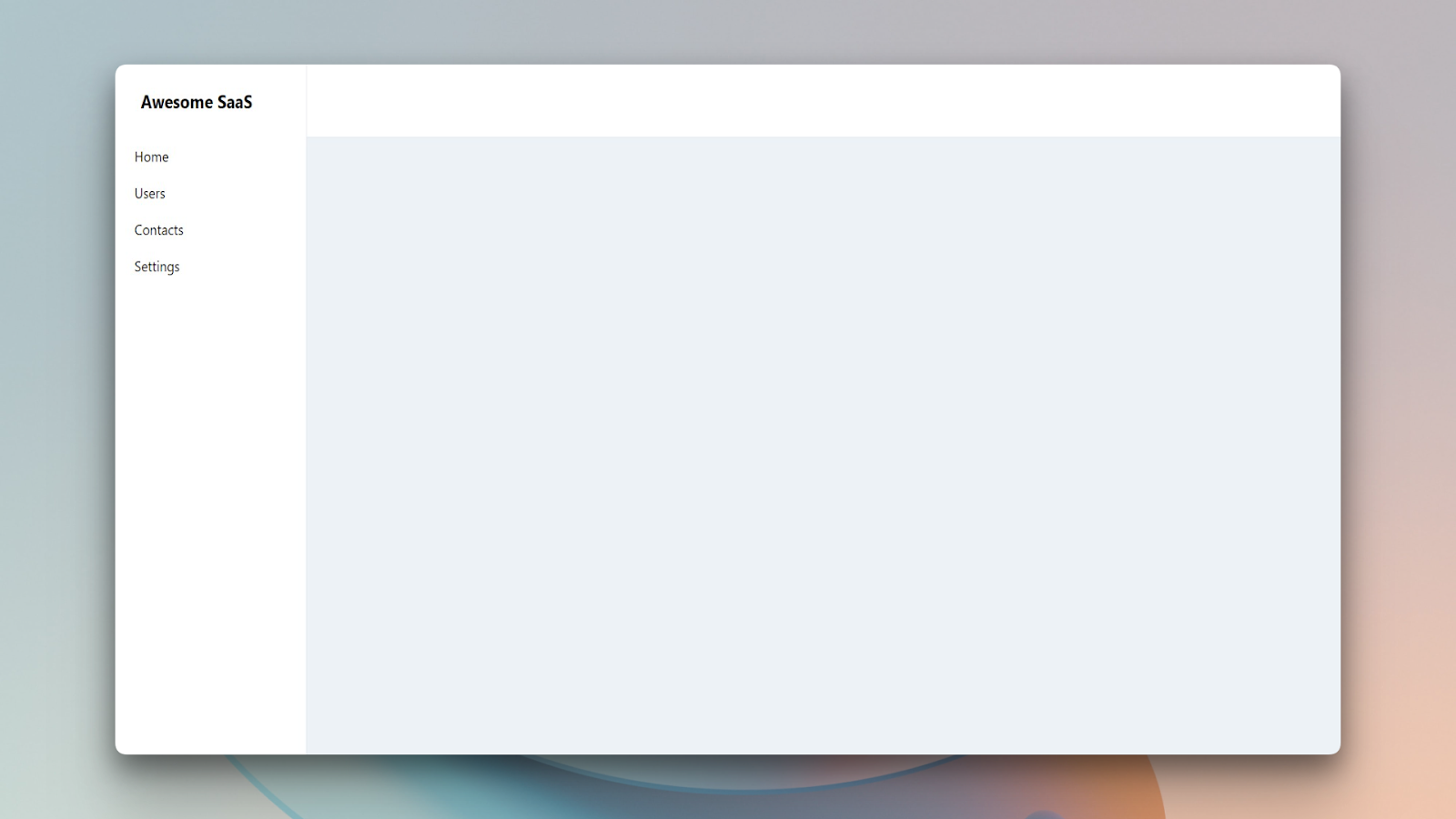
By default, the AppShell component is not responsive. If you don't create the MobileNav component, you'll be left with an unresponsive shell that is not good from the user experience perspective. To make the component responsive, it is essential that you create the MobileNav component and use it properly.
Creating this component can be a time-consuming job because of writing so much boilerplate code by yourself. Also, to make it look better, you'll need to put extra effort into it. Instead, you can use a component library like SaaS UI that is built with Chakra UI to speed up the development process. SaaS UI provides a pre-built AppShell component that you can just plug into your app.
Now, let's create a summary component that will show the summary of your data.
Building a Summary Component
Create a new file called Summary.tsx inside the Components folder and paste the following code there:
"use client";

import {
  Box,
  Grid,
  GridItem as ChakraGridItem,
  Heading,
  Text,
} from "@chakra-ui/react";

interface SummaryProps {
totalProjects: number;
completedTasks: number;
totalTasks: number;
teamCollaborations: number;
}

const GridItem = ({
title,
value,
percentage,
}: {
title: string;
value: number | string;
percentage?: number;
}) => (

 <ChakraGridItem
 borderRadius="0.375rem"
 backgroundColor="#F3F4F6"
 padding="0.5rem"

>

    <Heading
      marginBottom="0.5rem"
      fontSize="1rem"
      fontWeight="500"
      color="gray.500"
    >
      {title}
    </Heading>
    <Box>
      <Text fontSize="1.5rem" fontWeight="700" color="gray.700">
        {value}
      </Text>
      {percentage && (
        <Text
          color="green"
          fontFamily="monospace"
          fontSize="1.25rem"
          fontWeight="500"
        >
          {percentage > 0 ? "+" : ""}
          {percentage.toFixed(2)}%
        </Text>
      )}
    </Box>

  </ChakraGridItem>
);

const Summary = ({
totalProjects,
completedTasks,
totalTasks,
teamCollaborations,
}: SummaryProps) => {
const taskCompletionRate = (completedTasks / totalTasks) \* 100;

return (

{" "}

<Box
  display="flex"
  flexDirection="column"
  w="100%"
  mb="1.5rem"
  borderRadius="0.375rem"
  bgColor="white"
  p="1rem"
  boxShadow="0px 2px 4px rgba(0, 0, 0, 0.1)"
>
  <Heading mb="1rem" fontSize="1.25rem" fontWeight="600" color="gray.700">
    Project Summary
  </Heading>
  <Grid
    templateColumns={{
      base: "repeat(1, 1fr)",
      md: "repeat(3, 1fr)",
    }}
    gap="1rem"
  >
    <GridItem title="Total Projects" value={totalProjects} />
    <GridItem
      title="Tasks Completion Rate"
      value={`${completedTasks}/${totalTasks}`}
      percentage={taskCompletionRate}
    />
    <GridItem title="Team Collaborations" value={teamCollaborations} />
  </Grid>
</Box>
); };

export default Summary;
Let's discuss the code now:
- First, similar to the first component, the required components are imported from the Chakra UI library. After the import, the prop types are defined using a Typescript interface. The Summary component expects four properties: totalProjects, completedTasks, totalTasks, and teamCollaborations. All these props are numbers.
- The GridItem component is a functional sub-component designed to render individual grid items for the main Summary component. It expects three properties: title (a string for the grid item's title), value (a number or string representing the main value), and percentage (an optional number indicating a percentage value). Various Chakra UI components are used for styling within this component, including the ChakraGridItem, Heading, and Text.
- The Summary component is the main component. It receives props defined by the SummaryProps interface. The component calculates the taskCompletionRate based on the completedTasks and totalTasks props. Within the element, the Chakra UI Box, Heading, and Grid components structure the content and layout. The Grid component uses a responsive design with the templateColumns prop. It stacks grid items on smaller screens (base) and displays them in three columns on medium (md) and larger screens. Without using the object notation for responsiveness here, the component would show all three GridItems in the same row on smaller screens. For this, it is required to use the responsive properties that Chakra UI provides properly. The object notation is used here for the responsiveness.
Now, import the Summary component inside the page.tsx file and pass the required props. Your page.tsx file should look like this one:
import Summary from "@/Components/Summary";

export default function Home() {
  return (
    <main>
      <Summary
        totalProjects={5}
        completedTasks={3}
        totalTasks={10}
        teamCollaborations={2}
      />
    </main>
  );
}
If you view your application now, the UI should look like this:
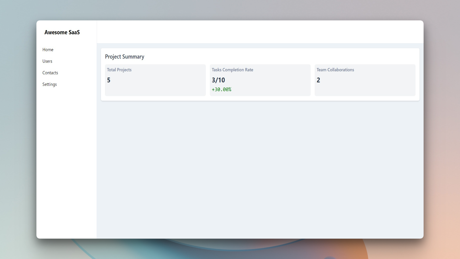
If you check the responsiveness of the application, you'll find that it is quite responsive, and all the elements adapt according to the screen size. Let's create one more component with Chakra UI.
Creating a Structured List in Chakra UI
A structured list is a table but with more complex types of data. In this section, you'll build a structured list containing an image, user's role, name, and bio. To build the component, create a new file called UserTable.tsx inside the Components folder. Once the file is created, paste the code there:
"use client";

import {
  Table,
  Thead,
  Tbody,
  Tr,
  Th,
  Td,
  Image,
  Box,
  Text,
  Heading,
} from "@chakra-ui/react";

const users = [
  {
    id: 1,
    name: "John Doe",
    designation: "Software Engineer",
    role: "Developer",
    description:
      "Lorem ipsum dolor sit amet, consectetur adipiscing elit. Sed malesuada, sapien vel bibendum bibendum, velit sapien bibendum sapien, vel bibendum sapien sapien vel bibendum bibendum, velit sapien bibendum sapien, vel bibendum sapien sapien vel bibendum bibendum, velit sapien bibendum sapien, vel bibendum sapien.",
    avatar: "https://via.placeholder.com/50",
  },
  {
    id: 2,
    name: "Jane Smith",
    designation: "UX Designer",
    role: "Designer",
    description:
      "Lorem ipsum dolor sit amet, consectetur adipiscing elit. Sed malesuada, sapien vel bibendum bibendum, velit sapien bibendum sapien, vel bibendum sapien sapien vel bibendum bibendum, velit sapien bibendum sapien, vel bibendum sapien sapien vel bibendum bibendum, velit sapien bibendum sapien, vel bibendum sapien.",
    avatar: "https://via.placeholder.com/50",
  },
  {
    id: 3,
    name: "Bob Johnson",
    designation: "Frontend Developer",
    role: "Developer",
    description:
      "Lorem ipsum dolor sit amet, consectetur adipiscing elit. Sed malesuada, sapien vel bibendum bibendum, velit sapien bibendum sapien, vel bibendum sapien sapien vel bibendum bibendum, velit sapien bibendum sapien, vel bibendum sapien sapien vel bibendum bibendum, velit sapien bibendum sapien, vel bibendum sapien.",
    avatar: "https://via.placeholder.com/50",
  },
  {
    id: 4,
    name: "Sarah Lee",
    designation: "Backend Developer",
    role: "Developer",
    description:
      "Lorem ipsum dolor sit amet, consectetur adipiscing elit. Sed malesuada, sapien vel bibendum bibendum, velit sapien bibendum sapien, vel bibendum sapien sapien vel bibendum bibendum, velit sapien bibendum sapien, vel bibendum sapien sapien vel bibendum bibendum, velit sapien bibendum sapien, vel bibendum sapien.",
    avatar: "https://via.placeholder.com/50",
  },
  {
    id: 5,
    name: "David Kim",
    designation: "Product Manager",
    role: "Manager",
    description:
      "Lorem ipsum dolor sit amet, consectetur adipiscing elit. Sed malesuada, sapien vel bibendum bibendum, velit sapien bibendum sapien, vel bibendum sapien sapien vel bibendum bibendum, velit sapien bibendum sapien, vel bibendum sapien sapien vel bibendum bibendum, velit sapien bibendum sapien, vel bibendum sapien.",
    avatar: "https://via.placeholder.com/50",
  },
];

const UserTable = () => {
  return (
    <>
      <Heading as="h2" size="base" mb={4}>
        Users
      </Heading>
      <Table variant="simple">
        <Thead>
          <Tr>
            <Th>User Image</Th>
            <Th>User Name and Designation</Th>
            <Th>User Role</Th>
            <Th>User Bio</Th>
          </Tr>
        </Thead>
        <Tbody>
          {users.map((user) => (
            <Tr
              key={user.id}
              _hover={{
                background: "gray.300",
                cursor: "pointer",
              }}
            >
              <Td>
                <Box w="50px" h="50px" borderRadius="full" overflow="hidden">
                  <Image src={user.avatar} alt="User Avatar" />
                </Box>
              </Td>
              <Td>
                <Text fontSize="sm">{user.name}</Text>
                <Text fontSize="xs" color="gray.500">
                  {user.designation}
                </Text>
              </Td>
              <Td>
                <Box
                  bg="gray.500"
                  color="white"
                  fontSize="xs"
                  px={4}
                  rounded={"xl"}
                  py={1}
                >
                  {user.role}
                </Box>
              </Td>
              <Td color={"gray.600"}>{user.description}</Td>
            </Tr>
          ))}
        </Tbody>
      </Table>
    </>
  );
};

export default UserTable;
Even though the code is pretty straightforward, let's discuss it in detail:
- First, the necessary components are imported from the Chakra UI library for creating the table. Components like Thead, TBody are based on the HTML table elements but the Chakra components provide more flexibility.
- Then, a sample data array containing details about different users like name, designation, role, description, and their avatar's URL is defined in a user variable.
- Inside the React functional component called UserTable, a heading called Users is specified using the Chakra UI Heading component.
- The main table component wraps around all other table-related components. The variant="simple" prop gives the table a basic and clean style.
- The THead section represents the table header. It contains rows () that hold header cells (). These header cells specify the column titles: "User Image", "User Name and Designation", "User Role", and "User Bio".
- Using the higher-order map method, a row is created for each user from the users array. Each row has a hover effect to change its background to gray.300 and turn the cursor into a pointer. Inside each row, there are 4 table data cells () corresponding to the user's image, name & designation, role, and bio. The user's image is wrapped inside a box to make it circular, and the user's role is displayed inside a rounded rectangle box with a gray background and white text.
The table is finally exported, and it is ready to be used inside the page.tsx file. Import it on the page.tsx file to render it to the DOM. The final page.tsx file should look like this:
import Summary from "@/Components/Summary";
import UserTable from "@/Components/UserTable";

export default function Home() {
  return (
    <main>
      <Summary
        totalProjects={5}
        completedTasks={3}
        totalTasks={10}
        teamCollaborations={2}
      />
      <UserTable />
    </main>
  );
}
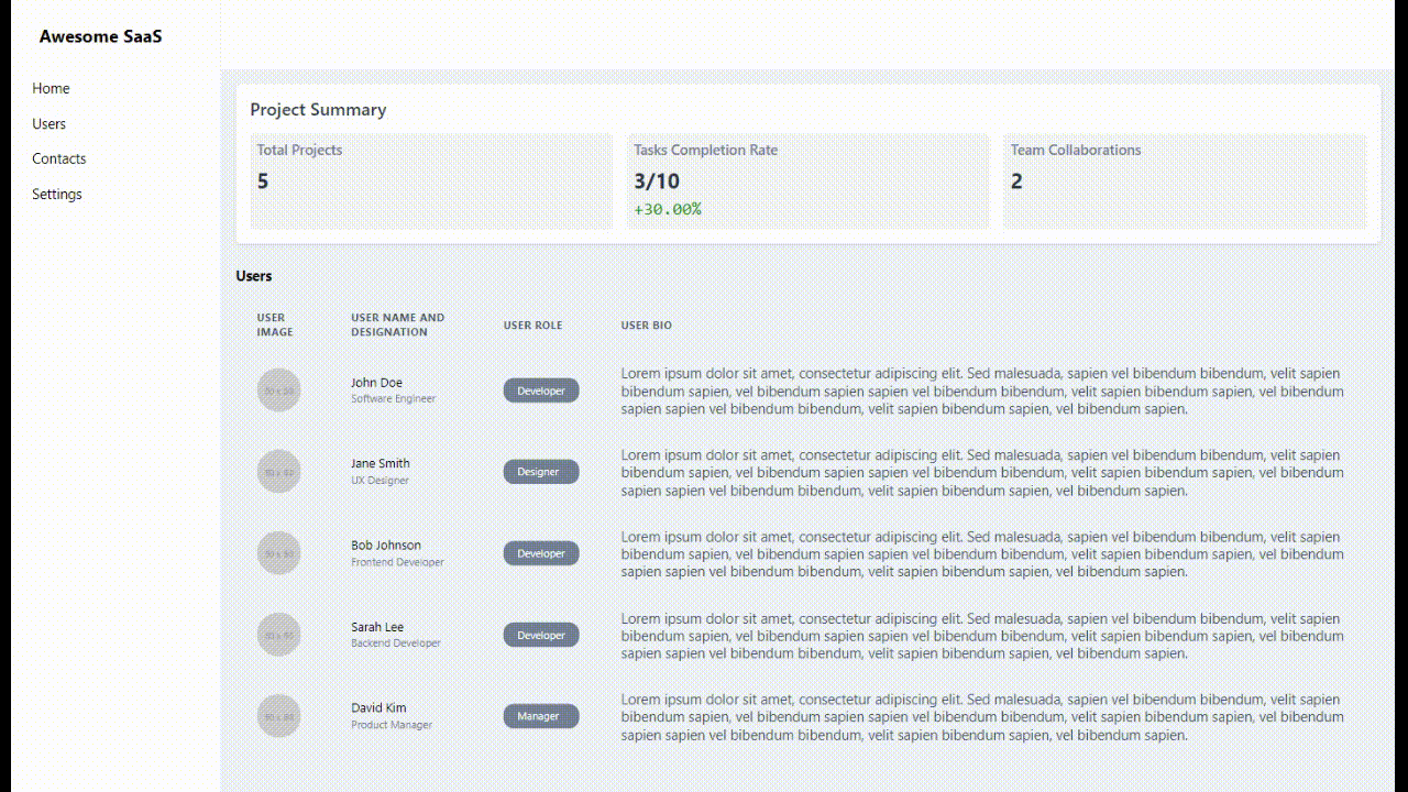
Your final SaaS app should look like this now:
It took quite some effort to create even a very basic version of a structured list. Even though the component is responsive, there are scopes of making it even better. The UI can also be made more crisp. But this will take even further effort just using Chakra UI. In these cases, utilising a library like SaaS UI that provides beautiful pre-designed components built on top of Chakra UI makes much more sense. For example, SaaS UI provides a much better-looking structured list that can be integrated into your application much more easily than what you build here. Building the complete application would've also taken much less time if you used the power of SaaS UI.
You can check this article if you want to know how to build SaaS dashboards using SaaS UI. The code for this article is available in this GitHub repo and you can take a look at the live preview here.
Conclusion
The article's main aim was to help you build a responsive SaaS application using Chakra UI. You built three components that are more or less used in almost every SaaS application --- an application shell, a summary card, and a structured list.
While Chakra UI offers attractive designs and ready-to-use components, if you don't have design expertise or the bandwidth to code from scratch, you can greatly benefit from using a specialized library like SaaS UI. Using SaasUI greatly helped to streamline the development process, which enabled faster application creation.
Further reading
Building a Modern SaaS Dashboard with Saas UI and Next.js App Router
Comments
Loading comments…