
Photo by Jamie Street on Unsplash
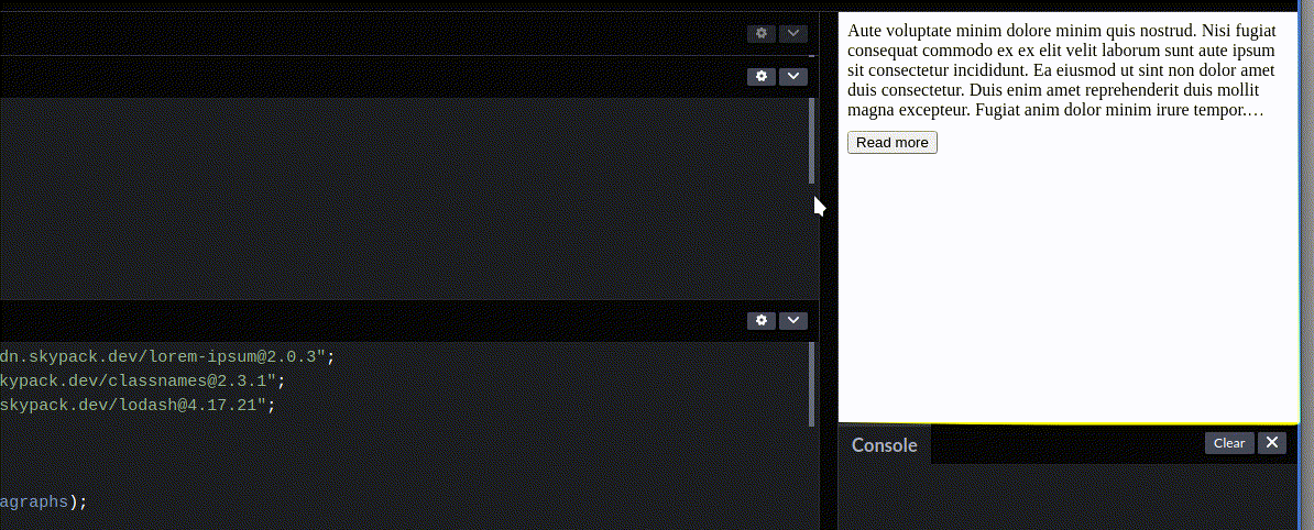
In the olden days, you would have to do all sorts of hacks in order to determine the height/width of one single line of text (in your font size, with your font type, give the width of the container). You could potentially create a canvas element in your JavaScript code, render the text and take measurements from there. Nowadays, although still vendor prefixed, line-clamp offers a much more elegant, CSS driven solution — the style-sheet does all the heavy lifting, all we need to do is specify the number of lines we want to have visible. I'll try to convey the way I implement this in the context of a React application. If you want to skip ahead and see the full solution (and just copy paste), you're welcome to base your work on this template. If you're in doubt whether you should use line-clamp, these should help you decide:
I think the caniuse stats are decent (it's now September 2021) but it all depends on your use case. Anyway — let's get cracking.
The styling
The simple part is the styling. Mozzila has a nice guide on the ins and outs, but for the purpose of our article, I'll just share the snippet bellow:
We will conditionally apply this CSS class to our element, as we want our component to be able to toggle between a “Read more” and a “Read less” state.
The component
We want a component that is able to:
-
display text
-
clamp text to a certain number of lines
-
show the entire text when clicking “Read more”
-
show the truncated version again when clicking on “Read less”
-
NOT render the Read more/less button when the text length doesn't require clamping
The component needs two internal states, clamped, which would determine whether the text is currently truncated (this would decide whether the button reads “Read more” or “Read less”, and whether the .clamp CSS is applied, and showButton, which would conditionally render the button based on whether it's necessary at all (this is determined by the dynamic text length and the fluid size of the container).
A simple click handler can flip the clamped state:
const handleClick = () => setClamped(!clamped);
and that state will in turn control whether we apply the .clamp class
<div className={classnames(“long-text”, clamped && “clamp”)}>
like so.
NOTE: I like to use the classnames package as a shorthand to conditional CSS classes (the bundlephobia report on it is kind, and I tend to use it in more then one place).
We more or less covered the following from our component structure:
The ever so slightly tricky part comes when we want to:
-
NOT render a button when the text length doesn't require clamping
-
check whether to render a button on window resize (if the container for the text is of fluid width, a window resize could cause it to change the number of effective lines rendered given the text)
We can achieve this in a useEffect hook. We want to be able to interact with the DOM instance of our element containing the text. We want to compare the element's clientHeight and scrollHeight. This is a “clever” way to check whether an element has CSS clamping applied to it. To interact with the DOM instance of an element and read those values, we set up the element with a ref prop and assign it a reference to our useRef hook result.
So we define let's say a containerRef constant like const containerRef = useRef(null); and we set the ref prop of the text container element to be ref={containerRef}. Given that setup our useEffect hook will look like the following:
-
We check whether the button should be available based on the check we perform on the element — that's the
hasClampingfunction. So if an element has clamping applied (theclientHeightandscrollHeightdiffer if that's the case) we show the button. -
We perform this check using the
checkButtonAvailabilityfunction on component load. Usinglodash, we debounce the call when we add it to an event listener so it isn't called too often. -
We make sure we use the
useEffectclean up return function to remove said listener (this will help us avoid memory leaks)
For the end, a few words about the checkButtonAvailability function. When mutating a reference created by a useRef hook we don't trigger a React rendering process. That's why it's safe to temporarily add the class .clamp to our element in order to see whether clamping would apply. This is important because of a small bug — if we don't do this, we can:
-
Resize the window to a small width forcing clamping.
-
After that if we click “Read more” the whole text is shown.
-
If we resize the window to a larger width, the button is no longer necessary and is hidden.
-
If we resize the window back to the small size, the whole text will be showing and no button will be rendered.
To get around this, we have to temporarily apply .clamp, let CSS work it's magic, check whether clamping is applicable and render the button based on that. We also save the original state so we can reapply it, otherwise every time you resize the window you'd have the “Read less” defaulting to “Read more” which is also less than desired IMHO.
Conclusion
I think that, even if we have a set way of resolving a common problem, it's always good practice to once in a while check with colleagues (or the internet) if there are new solutions available, check caniuse.com and see whether this would be supported widely enough for your use case and update your knowledge. Also, try to find a balance between reinventing the wheel each time, and just blindly stacking your project with npm packages.
Hope you find my article useful, I've tried to expand on a piece of code which I wouldn't think much of in production, but the details could hopefully, make someone a better dev. If you'd like to discuss my DMs are always open — you can find me on Twitter and LinkedIn.
Comments
Loading comments…