
Photo by Zetong Li on Unsplash
"When all are bearish, there is a cause for prices to rise. When everyone is bullish, there is a cause for the price to fall.
Homma Munehisa (1724 -1803), Japanese rice trader
This famous sentence is often attributed to Warren Buffet. But it truly comes from Homma Munehisa, a Japanese rice trader from the 18th century. He is the creator of the candlestick chart we are going to explore later in this blog post. The other chart I'm going to present is the OHLC.
He has impressively used this financial instrument to dominate the Japanese rice market. And it is now widely used by traders. Here is its principle:
The demand and supply of the price are heavily influenced by the emotions of traders. Therefore, these charts can help us to identify patterns and to make decisions on the stock price.
Remember, Homma Munehisa discovered and used this in the 18th century. If you are interested in stock analysis, you need to use these charts. I believe that data visualization is a huge difference-maker when working with data.
Let's see together how to plot them with Python.
The upside: mplfinance, a great library belonging to Matplotlib, does this perfectly with easy code. I put a link to the GitHub of mplfinance at end of the blog post. Let's dive in!
*Disclaimer**: This blog post is written only for educational purposes. There is no investment advice or promotion for any stock.*
1. Install Mplfinance and import needed libraries
First, let's install the mplfinance library. It is a separate module from Matplotlib, my favorite visualization library in Python. mplfinance is very powerful as we can plot great financial charts with it. We can plot different financial charts with it. This blog post will mainly focus on the candlesticks and OHLC charts.
We will also import yfinance and pandas.
pip install mplfinance

import mplfinance as mpf
import pandas as pd
import yfinance as yf
2. Retrieve stock data for our use case
Let's practice today with NVIDIA stock with its ticker.
ticker = "nvda"
nvda = yf.download(ticker, start="2022-01-01", end="2022-06-30")
nvda.head()
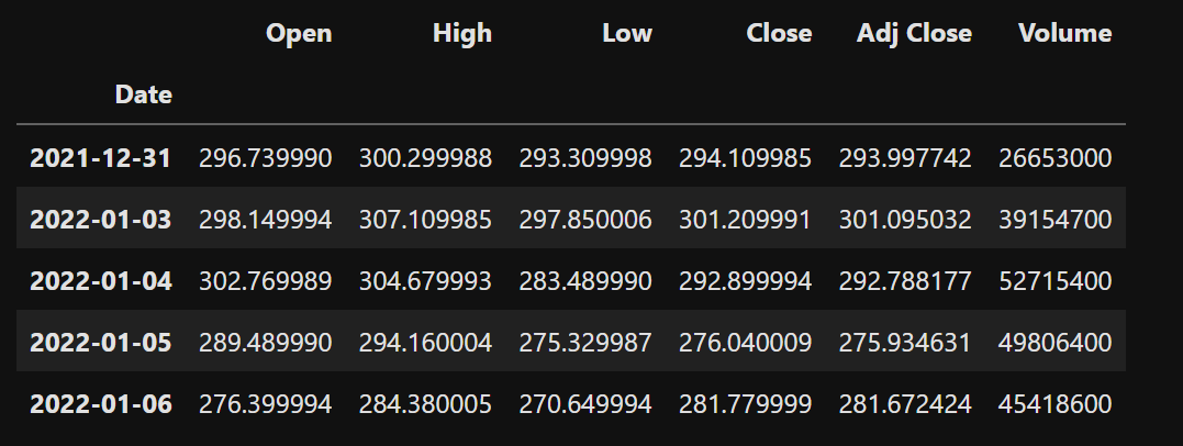
Nvidia stock data
3. Plot the candlesticks and OHLC charts
A. Candlestick Chart
Interestingly, this chart originated in Japan in the 18th century. Munehisa Homma, a Japanese rice trader noticed the link between supply and demand and introduced this chart. His observation was that emotions were strongly influencing the markets.
Let's plot it:
mpf.plot(nvda['2022-01-01':], type='candle', style = 'classic', title = 'Nvidia Stock Price',tight_layout = True)
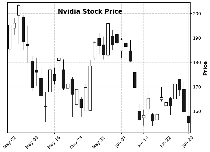
Code: you can see it as simple as it is with one line of code. Please note that you can choose the style for your chart. There are many available options. I chose here the classic one. The original candlestick chart from Homma Munehisa was done with black and white candles.
How to Read it
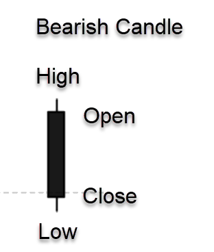
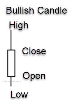
If the candle is black if open > close and white if open < close.
The information displayed on these candles gives us good insight into what's happening with price and the psychology of the traders.
The candlestick has a wide part, which is called the "real body." It represents the price range between the open and close. You have the wicks that show the high and low price of that trading day.
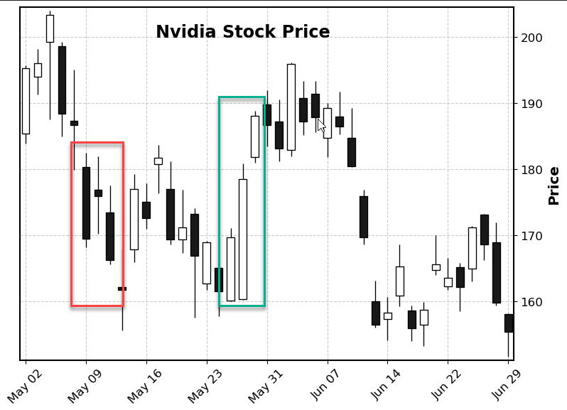
On May 9th, you can see a long bearish candle with a close lower by 6% vs the open and a long body that reflects the volatility and the emotions around the stock. That drop was due to the FED rate hike by 0.5% and high inflation concerns. The candle next to it is interesting to read: very small body but high and low wicks: we can see the uncertainty and indecision of traders.
Around the end of May, we observe a strong bullish trend. Nvidia had just published its first-quarter revenue which showed a strong increase of 46% year over year. Investors grew more optimistic about the company's growth prospects. Again, the candles let us read the emotions driving the stock's trend.
There are many candlesticks types with different descriptions and interpretations. I will post a link at the end of the blog post if you are interested to know more.
Adding Volume Bars and Moving Averages
We can add the volume bars with just the parameter volume set to True. I also switch here to the default chart style.
mpf.plot(nvda['2022-05-01':], type='candle', title = 'Nvidia Stock Price',tight_layout = True, volume = True)
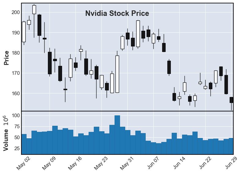
It's also important to know the volumes. We can see at end of May the higher volumes on the stock that had such an impact with the bullish white candle.
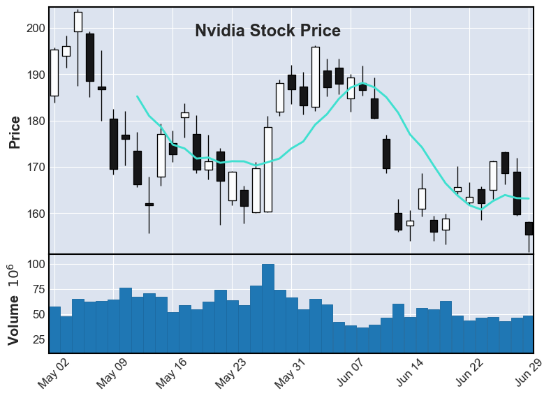
Adding the simple moving average is as easy: you need to use the parameter mav and set the number of days. As a reminder, it is the rolling mean price of a stock over a specified period. We can set it to 8 days for example.
mpf.plot(nvda['2022-05-01':], type='candle', title = 'Nvidia Stock Price',tight_layout = True, volume = True, mav = (8))
B. OHLC chart:
This acronym stands for "Open-High-Low-Close" and refers to the stock price value. It's a different variant from the candle chart.
Let's plot it to see what it looks like:
mpf.plot(nvda['2022-06-01':], style = 'yahoo', title='Nvidia Stock Price', tight_layout = True )
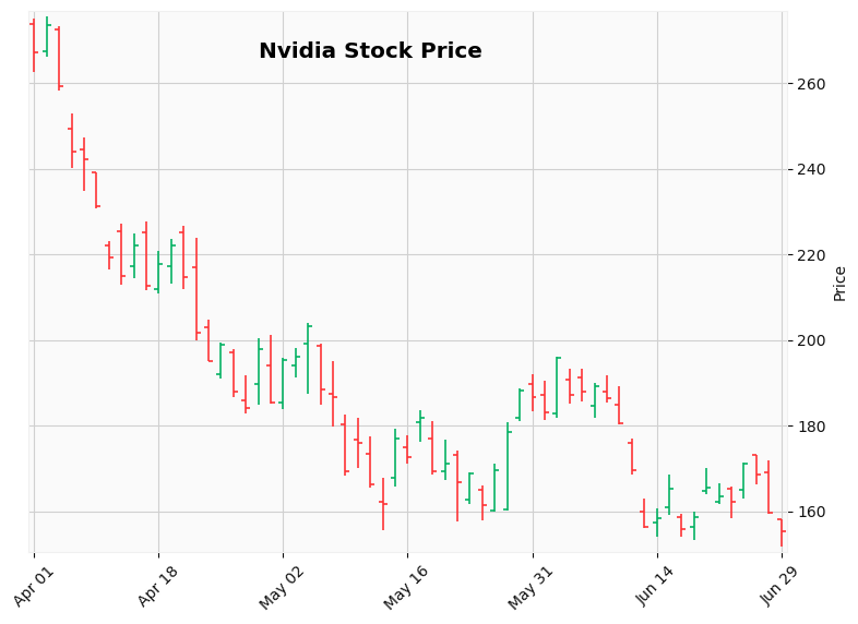
How to Read it
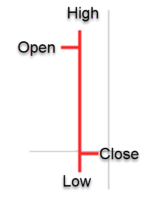
The graph is quite intuitive to read.
This chart is useful to track the momentum of a stock, whether it is increasing or decreasing.
If the open and close prices are far apart: it shows a strong momentum.
If they are very close: it shows indecision as the price can't choose a clear direction.
Height of the bar: the higher, the more volatility.
Bar color: green **(**close > open) or red (close < open).
We see more red bars showing the decreasing trend of the stock due to several factors (inflation, FED rate hikes, China lockdowns...).
Bonus: you can add another plot to the plot
Mplfinance offers the possibility to add information to the plot with the make_addplot function. You can find more documentation here.
Let's add lines that show the highs and lows of Nvidia's stock price.
high_low_lines = mpf.make_addplot(nvda.loc['2022-05-01':,['High','Low']])
mpf.plot(nvda["2022-05-01":], addplot=high_low_lines, title = 'Nvidia High and Low Trend', style = 'yahoo', tight_layout = True)
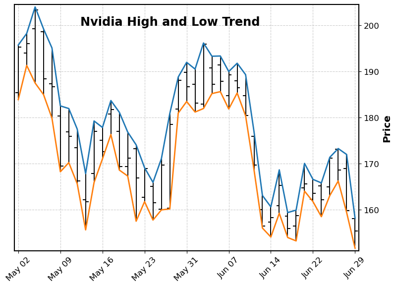
The blue line follows the highs and the orange line the lows
4. When to use the candlestick and OHLC?
It depends on your trading strategy.
Candlestick patterns offer a lot of information based on their shape and form. They are extremely useful to detect patterns as they are more visual. If you want to understand the traders' psychology, you need to use candlesticks.
On the other hand, OHLC provides simplicity which may be enough for most stock investors as it's easy to read.
5. Conclusion
Mplfinance provides us with an easy and efficient way to plot insightful charts like the candlestick one. If you spend time analyzing the patterns and read the emotions driving the stock price movements, this will help you tremendously to understand the traders' behaviors.
If you enjoyed this piece, please make sure to follow my profile, so you don't miss any of my upcoming articles.
You can also find me on LinkedIn.
References:
Candlestick Patterns: The 5 Most Powerful Charts (investopedia.com)
OHLC Chart Definition and Uses (investopedia.com)
matplotlib/mplfinance: Financial Markets Data Visualization using Matplotlib (github.com)
Comments
Loading comments…