In this article, we are going to create the floating action button(FAB) by using Pure CSS. We will use many CSS positioning to create this FAB, such as fixed and absolute.
First, we add a <div> with some words inside it. We also insert the fontawesome CDN.
<!DOCTYPE html>

<html lang="en">

<head>

<meta charset="UTF-8">

<meta http-equiv="X-UA-Compatible" content="IE=edge">

<meta name="viewport" content="width=device-width, initial-scale=1.0">

<title>Document</title>

<link rel="stylesheet" href="https://cdnjs.cloudflare.com/ajax/libs/font-awesome/6.0.0-beta2/css/all.min.css"

integrity="sha512-YWzhKL2whUzgiheMoBFwW8CKV4qpHQAEuvilg9FAn5VJUDwKZZxkJNuGM4XkWuk94WCrrwslk8yWNGmY1EduTA=="

crossorigin="anonymous" referrerpolicy="no-referrer" />

</head>

<body>

<div>some text</div>

</body>

</html>
Add the big button
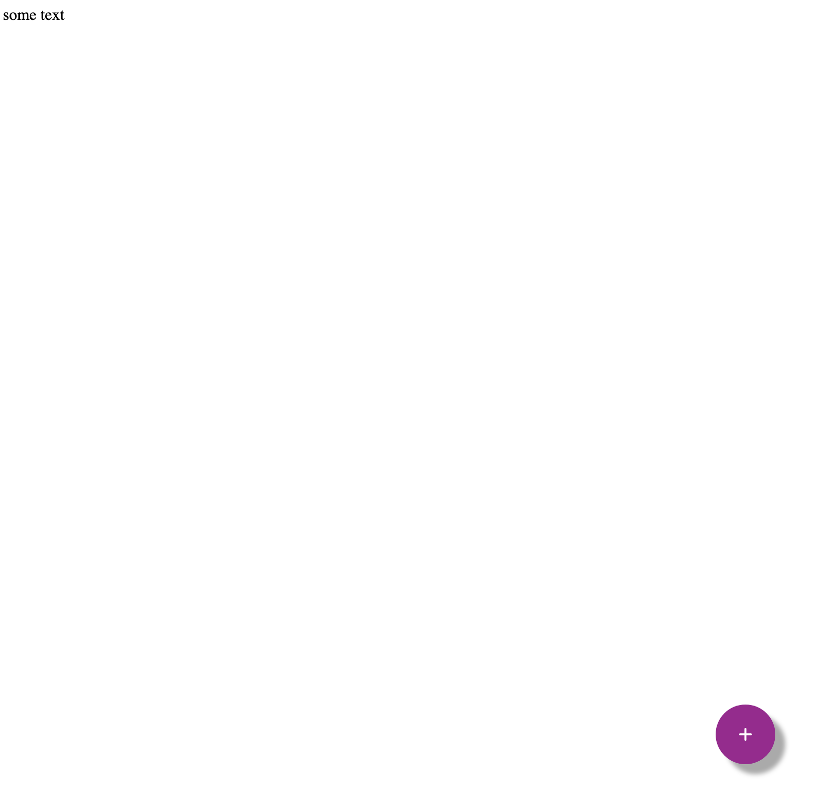
Now we want to create a big button on the bottom right. So we add the following <div>s.
Under the previous <div>. we add a <div class=”fab-container”> which will wrap all the buttons. We want to position all these things to the bottom right of the page
<body>

<div>some text</div>

<div class="fab-container">

<div class="button iconbutton">

<i class="fa-solid fa-plus"></i>

</div>

</div>

</body>
fab container
So we add the CSS rules, set the position fixed, 50px from bottom and 50px from the right. Add the cursor:pointer so it will look like a button.
.fab-container{

position:fixed;

bottom:50px;

right:50px;

cursor:pointer;

}
icon button
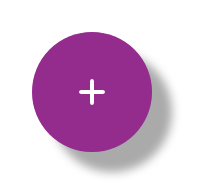
Then we add the <div class=”button iconbutton”> to wrap the fontawesome plus icon.
iconbutton is to create the circle icon button with pink color and have shadow under it.
button is to create a bigger button, so later user can trigger all the options by clicking on this big “+” button.
.iconbutton{

width:50px;

height:50px;

border-radius: 100%;

background: #FF4F79;

box-shadow: 10px 10px 5px #aaaaaa;

}

.button{

width:60px;

height:60px;

background:#A11692;

}
Center the icon
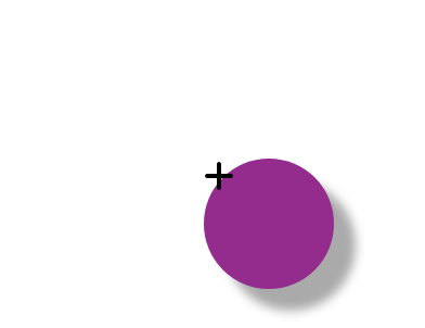
You can see the big button is created properly, but the “+” symbol not at the center. We need to center it by adding the following CSS rules. We also set the text color as white.
.iconbutton i{

display:flex;

align-items:center;

justify-content:center;

height: 100%;

color:white;

}
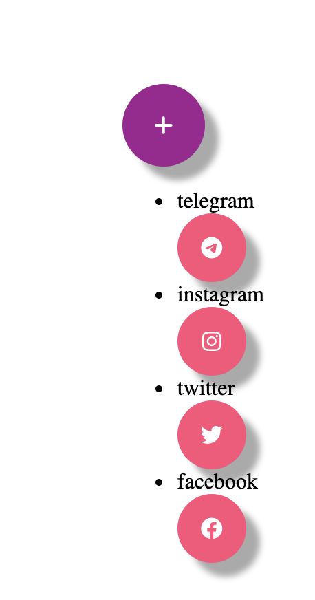
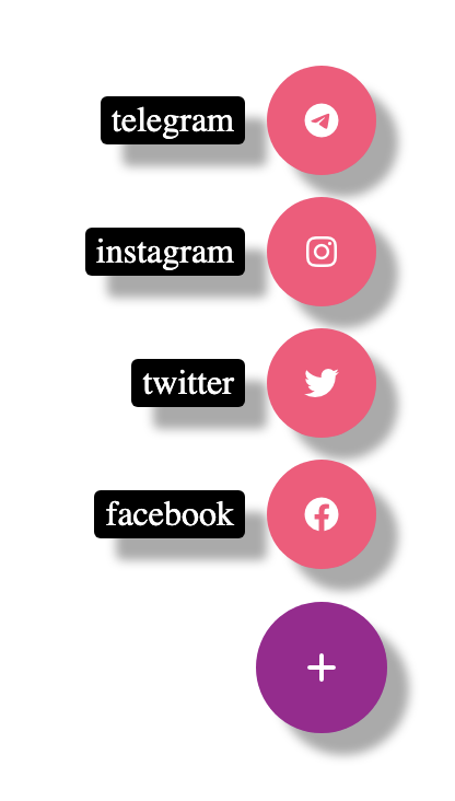
Add options list
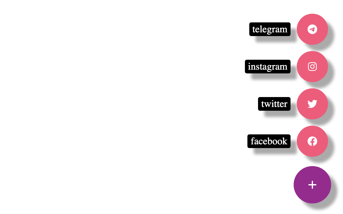
Under the big button, we add a list of options. Again we use the <div> with class “iconbutton” to wrap all the icons. We also add labels next to each button.
<ul class="options">

<li>

<span class="btn-label">telegram</span>

<div class="iconbutton">

<i class="fa-brands fa-telegram"></i>

</div>

</li>

<li>

<span class="btn-label">instagram</span>

<div class="iconbutton">

<i class="fa-brands fa-instagram"></i>

</div>

</li>

<li>

<span class="btn-label">twitter</span>

<div class="iconbutton">

<i class="fab fa-twitter"></i>

</div>

</li>

<li>

<span class="btn-label">facebook</span>

<div class="iconbutton">

<i class="fab fa-facebook"></i>

</div>

</li>

</ul>
Make the Big button at the bottom
To make the big button at the bottom, we can take the option list out of the normal flow by adding position:absolute .
Then we remove all the list style, so there are no bullet points. At last, set it 70px from the bottom.
list-style-type: none;

position:absolute;

bottom:70px;
Labels
You can see the labels are on top of each icon button. We want to make them side by side and push all things to the end of each row.
So we add the following style
.options li{

display:flex;

justify-content:flex-end;

padding:5px;

}
flex-end: items are packed toward the end of the flex-direction
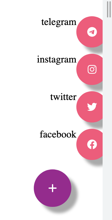
Now the labels and buttons are side-by-side. However, the list is lean on the right side, and part of it is already out of the screen.
So we need to go to add a rule under options in the CSS file.
.options{

list-style-type: none;

position:absolute;

bottom:70px;

**right:0;**

}
Set the right edge of the positioned
Now the options list is at the correct position.
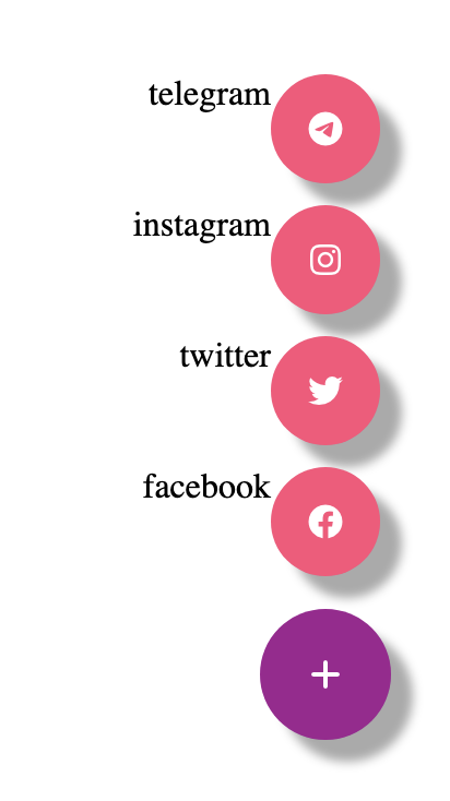
Style the label
We can continue to style the label. Add 2px vertical padding and 5px horizontal padding. Add 10px margin to the right, so leave some space between the button and the label.
Align self to center so it aligns vertically center with the button. Make the user-select to be none, so the text cannot be copied.
Set the background color to be black and the text color to be white. Set the border radius to 3px and add some shadow under it.
.btn-label{

padding:2px 5px;

margin-right:10px;

align-self: center;

user-select:none;

background-color: black;

color:white;

border-radius: 3px;

box-shadow: 10px 10px 5px #aaaaaa;

}
Comments
Loading comments…