
Getting the UI to look "just right" can be one of the major problems SaaS developers face when trying to tackle building an application on their own. They may have a killer idea, but not the design skills yet.
However, if you use the right libraries, all those problems go away and the end result not only looks good, but it also looks professional!
In this article, I'm going to show you how to build just such a modern, professional-looking SaaS app using Next.js (the App router), and Saas UI - a fully-typed, themeable, and WAI-ARIA-compatible component library for React, built on top of Chakra UI, that minimizes boilerplate and wheel-reinventions when building SaaS apps.
➡ Professionally crafted Chakra UI components
Let's get right to it!
Understanding the project
To show you the power of Saas UI, I'm going to build a User Management system on top of Next.js.
The system will have 3 main screens:
- The homepage, where we'll simply show the number of users in the system.
- The "new user" section, which is where you'll create the users.
- The "list users" section, where we'll make a quick list of users and show their data.
Here are a few screenshots of the resulting application:
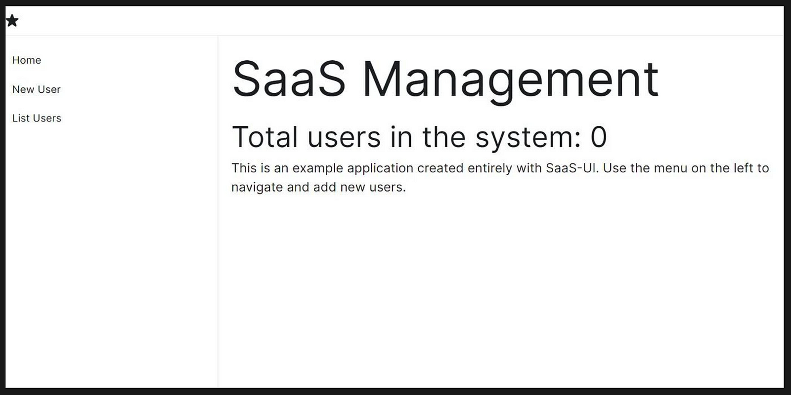
The home screen
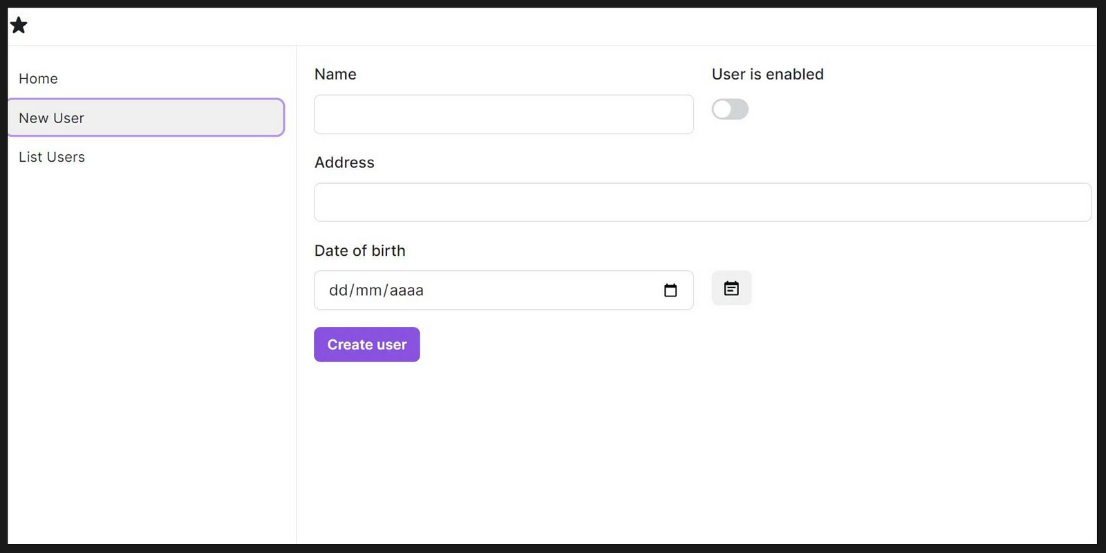
The "New User" section
As part of this application, we'll also handle things like "empty states" and user feedback.
With that said, let's get coding!
Setting up the project
To get started with both, Next.js and Saas UI, you'll have to run the following commands:
Set up a Next app
npx create-next-app@latest
Install Saas UI together with its dependencies
npm i @saas-ui/react @chakra-ui/react @emotion/react@^11 @emotion/styled@^11 framer-motion@^ @saas-ui/date-picker @saas-ui/sidebar @chakra-ui/icons6
Here you have the list of all other frameworks that are compatible with Saas UI and how to get started with them as well.
Updating the layout
By looking at the above screenshots, you've probably noticed the left-hand side menu. That general layout needs to be coded into the general layout.js file inside the app folder.
In the end, it should look like this:
"use client";

import "./globals.css";
import { Inter } from "next/font/google";
import NextLink from "next/link";

import { AppShell } from "@saas-ui/react";
import { Sidebar, SidebarSection, NavItem, SaasUILogo } from "@saas-ui/sidebar";
import { SaasProvider } from "@saas-ui/react";
import { Box } from "@chakra-ui/react";
import { userContext as UserContext } from "@/components/UserContext";
import { StarIcon } from "@chakra-ui/icons";

const inter = Inter({ subsets: ["latin"] });

const Link = (props) => {
  return <NextLink {...props} legacyBehavior />;
};
export const metadata = {
  title: "Create Next App",
  description: "Generated by create next app",
};

export default function RootLayout({ children }) {
  return (
    <html lang="en">
      <body className={inter.className}>
        <SaasProvider linkComponent={Link}>
          <AppShell
            navbar={
              <Box as="header" borderBottomWidth="1px" py="2" px="4">
                <StarIcon />
              </Box>
            }
            sidebar={
              <Sidebar>
                <SidebarSection>
                  <NavItem href="/">Home</NavItem>
                  <NavItem href="/new-user">New User</NavItem>
                  <NavItem href="/list-users">List Users</NavItem>
                </SidebarSection>
              </Sidebar>
            }
          >
            <UserContext.Provider value={{ users: [] }}>
              {children}
            </UserContext.Provider>
          </AppShell>
        </SaasProvider>
      </body>
    </html>
  );
}
The relevant parts of the code are:
- The
SaaSProvidercomponent which is mandatory to get everything else to work on the rest of the pages. - The
linkComponentproperty on theSaaSProviderused to overwrite Next's defaultLinkcomponent. This is required by Saas UI, so if you're using Next.js, you have to overwrite it like this. - The
AppShellcomponent provides a very simple way of setting up our layout (with the left menu and so on). - The content of the
AppShellcomponent is going to be the actual application, which is why we pass thechildrenthere. - But before we do, we also use the
UserContextprovider (read here if you want to know more about using context in React). Here is where I'll be storing our users. Instead of saving the data inside an external database, I'm just keeping them in memory. - Notice the
'use client'at the top of the file. We'll be using it on every file, because with Next.js, that turns all our components into server components (if they're inside theappfolder) by default. This is why we have to force them to be client components.
Once this is all set up, the next step is to start working on each individual page, so let's look at the simplest one first: the homepage.
Setting up the homepage
The homepage is pretty much a static page, where I'm only showing the number of users in the system at any given time.
The code? Just as simple:
"use client";
import styles from "./page.module.css";
import { Box, Text } from "@chakra-ui/react";
import { useContext } from "react";
import { userContext } from "@/components/UserContext";

export default function Home() {
  let { users } = useContext(userContext);

  return (
    <div style={{ height: "100%" }}>
      <Box as="main" flex="1" py="2" px="4" overflowY="auto">
        <Text fontSize="6xl"> SaaS Management</Text>
        <Text fontSize="4xl"> Total users in the system: {users.length}</Text>
        <Text>
          This is an example application created entirely with Saas-UI. Use the
          menu on the left to navigate and add new users.
        </Text>
      </Box>
    </div>
  );
}
This page doesn't really need much explanation, but here are points to highlight:
- We're getting the list of users from the context with the
useContexthook. - We're formatting text with the
Textcomponent and thefontSizeproperty.
Let's look at how to create a form with Saas UI now.
Building a Form with Saas UI
Saas UI has all you need to build a form, and control its layout and validation without having to do much extra work on your own.
The form we'll be building has only 4 fields, but some of them are non-standard, and I wanted to show you how that works with this library.
So here is the code:
"use client";
import { Box, Button, FormControl, FormLabel, Input } from "@chakra-ui/react";
import {
  DatePicker,
  DatePickerCalendar,
  DatePickerDialog,
  DatePickerTrigger,
} from "@saas-ui/date-picker";
import {
  Field,
  Form,
  FormLayout,
  SubmitButton,
  useSnackbar,
} from "@saas-ui/react";
import { useContext, useRef, useState } from "react";
import { CalendarIcon } from "@chakra-ui/icons";
import { userContext } from "@/components/UserContext";

function formatDate(dateString) {
  const dateParts = dateString.split("-");
  const year = dateParts[0];
  const month = parseInt(dateParts[1], 10);
  const day = parseInt(dateParts[2], 10);

  // Create an array of month names
  const monthNames = [
    "January",
    "February",
    "March",
    "April",
    "May",
    "June",
    "July",
    "August",
    "September",
    "October",
    "November",
    "December",
  ];

  // Format the date string
  const formattedDate = `${monthNames[month - 1]} ${day}, ${year}`;

  return formattedDate;
}

function createUser(name, enabled, address, birthdate) {
  return {
    name,
    enabled: enabled ? "Yes" : "No",
    address,
    birthdate: formatDate(birthdate),
  };
}

const RESET_TIMEOUT = 9000;
const INITIAL_BIRTHDATE = "24/10/1983";

export default function NewUser() {
  let { users } = useContext(userContext);
  const [userEnabled, setUserEnabled] = useState(false);
  const [birthdate, setBirthdate] = useState(INITIAL_BIRTHDATE);

  const snackbar = useSnackbar();

  let nameRef = useRef();
  let enabledRef = useRef();
  let addressRef = useRef();

  let interval = null;

  function resetForm(isTimeout) {
    if (!isTimeout) clearTimeout(interval);
    if (nameRef.current) nameRef.current.value = "";
    setUserEnabled(false);
    if (addressRef.current) addressRef.current.value = "";
    setBirthdate(INITIAL_BIRTHDATE);
  }

  function addUser() {
    const usr = createUser(
      nameRef.current.value,
      userEnabled,
      addressRef.current.value,
      birthdate.toString()
    );
    users.push(usr);
    snackbar({
      title: "User created!",
      description:
        "The user was created and it was added to the memory data store",
      status: "success",
      duration: RESET_TIMEOUT,
      isClosable: true,
      onCloseComplete: resetForm,
    });
    interval = setTimeout(() => {
      resetForm(true);
    }, RESET_TIMEOUT);
  }

  return (
    <Box p={4}>
      <Form onSubmit={addUser}>
        <FormLayout>
          <FormLayout columns={2}>
            <Field
              name="name"
              label="Name"
              ref={nameRef}
              type="text"
              rules={{ required: true }}
            />
            <Field
              name="enabled"
              ref={enabledRef}
              label="User is enabled"
              type="switch"
              onChange={() => setUserEnabled(!userEnabled)}
              value={userEnabled}
            />
          </FormLayout>
          <Field
            name="address"
            ref={addressRef}
            label="Address"
            type="text"
            rules={{ required: true }}
          />
          <FormControl>
            <FormLabel>Date of birth</FormLabel>
            <FormLayout columns={2}>
              <Input type="date" value={birthdate} />
              <DatePicker onChange={setBirthdate}>
                <DatePickerTrigger>
                  <Button>
                    <CalendarIcon />
                  </Button>
                </DatePickerTrigger>
                <DatePickerDialog>
                  <DatePickerCalendar />
                </DatePickerDialog>
              </DatePicker>
            </FormLayout>
          </FormControl>
          <SubmitButton>Create user</SubmitButton>
        </FormLayout>
      </Form>
    </Box>
  );
}
Some highlights from the code:
- With the
FormLayoutcomponent, you can either vertically stack (by default) theFieldcomponents inside, or you can specify the number ofcolumnsto have them side-by-side. - The switch is easily achieved by setting the
typeparameter toswitchon theFieldcomponent. - Fields are marked as mandatory, by configuring the
rulesproperty to{required: true}. - I'm triggering a snackbar notification (which is the little notification that pops up from the bottom of the page) when the user is properly saved by calling the function returned by the handy
useSnackbarhook. - Notice how the
createUserfunction simply returns an object, that then gets added into theusersarray on the context's state. - For the birthdate field, I went a little extra mile, because by default, the input with type
dateis already properly handled by the browser. So a date picker is shown automatically. However, I also wanted to give you a glimpse of how to create a custom Date Picker, so I used theDatePickercomponent next to the date field. To capture the value when I submit the form, I'm actually using the one set by the date picker, not the value on the date field. This is by definition a case of over-engineering, but given how tricky some date pickers can be, I wanted to show you how easy it was to set up one with Saas UI.
And that's pretty much it, creating a form with Saas UI was definitely easy, and the documentation had everything I needed to know.
Let's now take a look at the last page, the list of users.
Creating the List of users
The list of users is interesting because lists usually can benefit from having what is known as "an empty state". In other words, showing a page with only headers and no content is poor UX, so instead, you should set up a specific version of that list for the case when there is nothing to show.
In our case, until you add your first user, there is nothing to show, and the page should look like this:
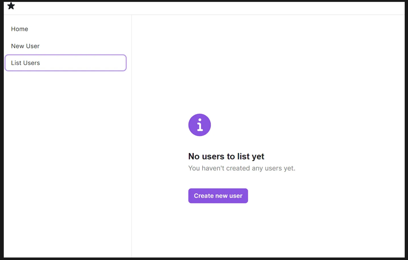
The message clearly states what's happening, and the button redirects to you a place where you can solve the "problem".
Once the system has some data, it'll show this version instead:
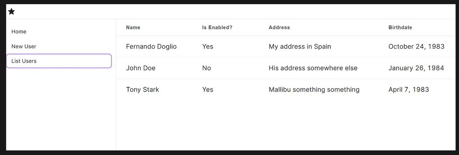
Simple, clean. Here is the code to do it:
"use client";
import { userContext } from "@/components/UserContext";
import { InfoIcon } from "@chakra-ui/icons";
import { Box, Button } from "@chakra-ui/react";
import { DataTable, EmptyState } from "@saas-ui/react";
import Link from "next/link";
import { useContext } from "react";
import { AbsoluteCenter } from "@chakra-ui/react";

export default function ListUsers() {
  let { users } = useContext(userContext);

  return (
    <>
      {users.length > 0 && (
        <Box overflowX="auto">
          <DataTable
            columns={[
              {
                accessor: "name",
                Header: "Name",
              },
              {
                accessor: "enabled",
                Header: "Is Enabled?",
              },
              {
                accessor: "address",
                Header: "Address",
              },
              {
                accessor: "birthdate",
                Header: "Birthdate",
              },
            ]}
            data={users}
            isSortable={true}
          />
        </Box>
      )}
      {users.length == 0 && (
        <AbsoluteCenter axis="both">
          <EmptyState
            colorScheme="primary"
            icon={InfoIcon}
            title="No users to list yet"
            description="You haven't created any users yet."
            actions={
              <>
                <Link href={"/new-user"}>
                  <Button colorScheme="primary">Create new user</Button>
                </Link>
              </>
            }
          />
        </AbsoluteCenter>
      )}
    </>
  );
}
As you can see, there is very little markup considering that we're showing a table listing data with 4 columns, and the data is sortable.
- The entire data table is managed by the
DataTablecomponent (read more about it here), you can give it the columns with the information of the header value (the string to show to the user), and the accessor (which is the property to show from the user), and it'll do the rest for you. - The case of the "empty state" is solved by using the
EmptyStatecomponent. It provides a simple markup for the message. You specify the color scheme, the icon for the top, the title, and the description, and the component will do the rest. You can also specify a set of actions, to display at the bottom (like the button I added). - I'm also using the
AbsoluteCentercomponent to solve the age-old problem of centering a div on the screen :)
In the end, this page was trivial to create, especially so thanks to the DataTable component, it definitely solved several problems I didn't want to face.
And that's it! The UI is complete, and, if I may say so myself, it looks awesome!
Here you can download the full source code.
For sure, I would've had a lot more trouble trying to get it to look like this.
As a final note, you've probably seen some imports from @chakra/... that's because Saas UI is built on top of Chakra UI, so the basic components like Box are all coming from there.
Have you used Saas UI before? Are you planning on using it now? Share your thoughts in the comments section, I'd love to know what you think about it!
Comments
Loading comments…