
My Journey
I first noticed scroll shadows in gmail — when you scrolled down on the inbox, a small shadow appears on the top toolbar, indicating that there is something underneath it and therefore is scrollable. I loved this. It subtly told users that there was something hidden in the current viewport and that this would be visible if you scrolled in that direction. I wanted to do something similar for my application.
CSS Scroll Shadows
This effect can be achieved entirely with CSS. It involves multiple background images stacked on top of each other. To achieve a single scroll shadow, you will need a a shadow and a shadow cover. The shadow is the shadow effect you see when there is scrollable content. The shadow cover will cover the aforementioned shadow when there is no more scrollable content. Along with other background attributes, the CSS for a vertical scroll shadow is as follows:
background-image: linear-gradient(to top, white, white),
    linear-gradient(to top, white, white),
    linear-gradient(to top, rgba(0, 0, 0, 0.25), rgba(255, 255, 255, 0)),
    linear-gradient(to bottom, rgba(0, 0, 0, 0.25), rgba(255, 255, 255, 0));
  background-position: bottom center, top center, bottom center, top center;
  background-color: white;
  background-repeat: no-repeat;
  background-size: 100% 20px, 100% 20px, 100% 10px, 100% 10px;
  background-attachment: local, local, scroll, scroll;
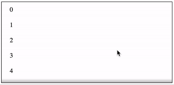 Vertical Scroll Shadow
If you want a horizontal scroll shadow, simply swap the top, bottom, height, and width variables.
background-image: linear-gradient(to right, white, white),
    linear-gradient(to right, white, white),
    linear-gradient(to right, rgba(0, 0, 0, 0.25), rgba(255, 255, 255, 0)),
    linear-gradient(to left, rgba(0, 0, 0, 0.25), rgba(255, 255, 255, 0));
  background-position: left center, right center, left center, right center;
  background-repeat: no-repeat;
  background-color: white;
  background-size: 20px 100%, 20px 100%, 10px 100%, 10px 100%;
  background-attachment: local, local, scroll, scroll;
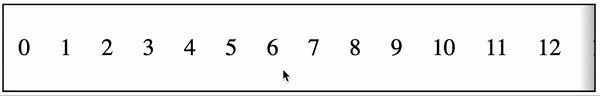 Horizontal Scroll Shadow
Note: if you’re truly intent on understanding the exact internals, use different colors for the linear gradient so you can visually see how each background contributes to the total effect.
Javascript Scroll Shadows
The same effect can be achieved through Javascript. By listening on scroll events, you can enable / disable absolutely positioned before and after pseudoselectors that create the shadows. Using React and Styled Components, the code would look something like this to achieve the same effect:
const Shadow = styled.div`
  position: relative;
  border: 1px solid black;
  ${props =>
    props.showStart
      ? css`
          ::before {
            content: '';
            position: absolute;
            top: 0;
            left: 0;
            right: 0;
            height: 10px;
            background: linear-gradient(
              to top,
              rgba(255, 255, 255, 0),
              rgba(0, 0, 0, 0.25)
            );
          }
        `
      : ''}
  ${props =>
    props.showEnd
      ? css`
          ::after {
            content: '';
            position: absolute;
            bottom: 0;
            left: 0;
            right: 0;
            height: 10px;
            background: linear-gradient(
              to bottom,
              rgba(255, 255, 255, 0),
              rgba(0, 0, 0, 0.25)
            );
          }
        `
      : ''}
`;

const Container = styled.div`
  height: 200px;
  overflow: auto;
`;

const Content = styled.div`
  padding: 10px 20px;
`;

const VerticalJSScrollShadow = () => {
  const [showStart, setShowStart] = React.useState(false);
  const [showEnd, setShowEnd] = React.useState(false);
  const ref = React.useRef();

  React.useEffect(() => {
    const onScroll = () => {
      const { scrollHeight = 0, scrollTop = 0, offsetHeight = 0 } =
        ref.current || {};
      setShowStart(scrollTop > 0);
      setShowEnd(scrollTop + offsetHeight < scrollHeight);
    };
    onScroll();
    const node = ref.current;
    node.addEventListener('scroll', onScroll);
    return () => {
      node.removeEventListener('scroll', onScroll);
    };
  }, []);

  return (
    <Shadow showEnd={showEnd} showStart={showStart}>
      <Container ref={ref}>
        {Array.from(Array(20)).map((i, idx) => (
          <Content key={idx}>{idx}</Content>
        ))}
      </Container>
    </Shadow>
  );
};
A similar effect can be achieved for horizontal scroll shadows by using left, right, and widths instead. See here for the full implementation.
Pros + Cons
Given these two drastically options to create a same effect, there are some small important differences.
**Performance: **The CSS approach is significantly better as it is achieved through a single render whereas the Javascript approach requires multiple renders to set the showStart and showEnd states.
Browser Supportability: The CSS approach does not work in Safari (as of Safari 14). The shadow will appear, but will not disappear as you scroll. The Javascript approach does not have this supportability issue.
Development: The CSS approach is a lot simpler than the Javascript approach. The CSS approach only needs to set background styles while the Javascript approach requires refs, state, and scroll listeners.
Final Thoughts
In my application, I initially chose the CSS approach. When I realized the Safari issue, I prototyped the Javascript approach but ultimately decided against it — the needs of a few Safari users were not worth the performance hit to all users. Regardless of the approach though, scroll shadows are a fantastic visual tool that will help users better navigate any application.
Comments
Loading comments…