Amidst the excitement of creating a SaaS solution, a challenging aspect is often overlooked: visual feedback, a critical component of the user experience.
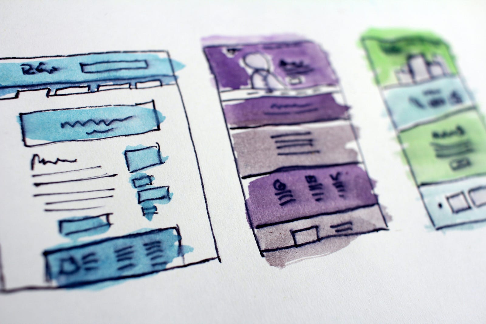
Last week, I started coding the initial lines of code for a small SaaS project after some planning and research. I crafted the wireframe and devised the architecture to visualise the components and their structure.
Here is what it looks like, made from this awesome tool: Excalidraw
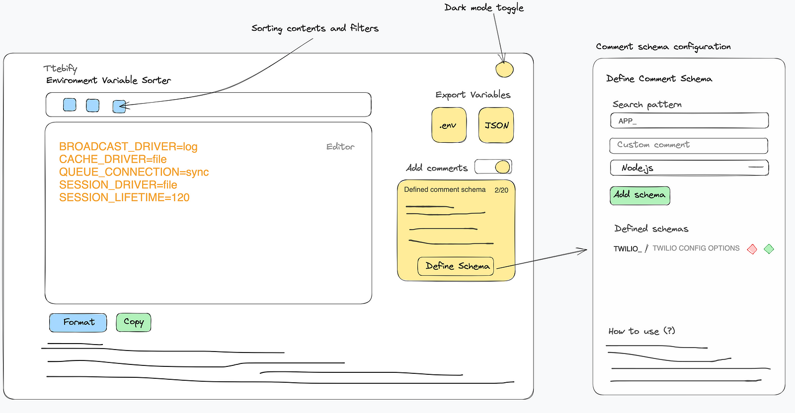
Wireframe and architecture diagram of the Env Sorter SaaS project.
I could use Tailwind CSS and leave it at that, but to go live with this I'd need to address some crucial aspects - a cohesive theme, robust data validation forms, a responsive UI, and, perhaps most importantly for my SaaS offering, proper visual feedback for my users.
I took my time to check out the Saas UI React component library and realised that it was basically built to solve that problem. Saas UI is a React component library that helps developers build beautiful, responsive, customizable designs for SaaS applications, and quickly. It is built on top of Chakra UI, a popular component library that provides a wide range of components and utilities.
Let's dive right in and see how Saas UI helped me quickly design my SaaS app, and go live with it.
The Role of Visual Feedback in UI/UX design
Visual feedback encompasses more than just the elements users see on your UI; it is a crucial aspect of design that aids users in understanding the flow of completing tasks within an application. It goes beyond mere comprehension and actively involves users in the process of guiding their journey to accomplish those tasks. According to David Hogue, a UX design lead at Google, visual feedback addresses questions in four key categories:
- Location of the user
- Current status of the application
- Future status of the application
- Outcomes and results after some actions have happened
A positive user experience directly impacts how individuals perceive and value your product, ultimately determining who will be willing to pay for it - this is the primary objective of any SaaS software.
So in this article, we will enhance the quality of an open-source project called the Environment Variable Sorter by implementing proper visual feedback with Saas UI, which has components specifically for this purpose.
Throughout this process, you will gain insights into how visual feedback can enhance various aspects, including:
- Understanding user expectations and behaviour
- Enhancing user engagement and satisfaction
- Reducing user frustration and errors
Implementing Visual Feedback in Your SaaS App
Setting up the Development Environment
The existing application lacks visual feedback and fails to address crucial accessibility considerations, both of which are provided out of the box by Saas UI. The project has already been developed using Next.js, TypeScript, and Tailwind CSS.
To provide a visual representation, here's a GIF showcasing the current state of the application:
GIF showcasing the current state of the application
For your convenience, the project is available on GitHub. In order to ensure accurate reference points throughout this tutorial, I will include a link to the commit hash of the application's current state. You can find the commit hash here.
Installing Saas UI and its dependencies
If you are interested in integrating Saas UI into a new Next.js project, you can refer to the "Getting Started with Next.js" guide available on the Saas UI documentation. However, in this tutorial, our focus will be on adding Saas UI to an existing project. Let's explore just how straightforward this process can be.
Note: The primary objective of this tutorial is to understand how visual feedback in your SaaS app can significantly enhance the overall quality of your product.
Let's proceed. To install Saas UI, run the following command:
yarn add @saas-ui/react @chakra-ui/react @chakra-ui/next-js @emotion/react@11 @emotion/styled@11 framer-motion@6
The next step is to set up our application providers:
SaasProvider: This provider enables us to utilise all the helpful components and hooks provided by Saas UI in our codebase. We will also customise thelinkComponentprop within this provider to ensure compatibility with the Next.js router.CacheProvider: In addition to Saas UI, Chakra UI offers the@chakra-ui/next-jspackage, which enhances the experience of using Saas UI within a Next.js app. As stated in the Saas UI documentation, "this provider is necessary to ensure that computed styles are included in the initial server payload during streaming".AppProvider: This provider is specific to our application and is responsible for managing environment-related states.
To group all our application-related providers into a single component, let's create a new file called providers.tsx within the app/layout directory. Below is an example of how this newly created file should look like:
"use client";

import React from "react";
import { AppProvider } from "@env/contexts/AppContext";
import { SaasProvider } from "@saas-ui/react";
import Link from "next/link";
import { CacheProvider } from "@chakra-ui/next-js";

type Props = { children: React.ReactNode };

function Providers({ children }: Props) {
 return (

{" "}
<CacheProvider>

  <SaasProvider linkComponent={Link}>
    <AppProvider>{children}</AppProvider>
  </SaasProvider>

</CacheProvider> ); }

export default Providers;
Notice that we added a "use client" directive at the top of our file, this is a new feature in Next.js that informs Next.js that this component should be executed on the client-side rather than the server-side.
Now we have completed the Provider component, we will now include this component to the app/layout.tsx file which essentially makes all the providers accessible to all parts of our application.
In the app/layout.tsx file, we add:
// Other imports
import Providers from "./providers";

type RootLayoutProps = { children: React.ReactNode };
export default function RootLayout({ children }: RootLayoutProps) {
 return (

{" "}

<html lang="en">

  <body className={inter.className}>
    <Providers>{children}</Providers>
  </body>

</html>
 ); }
At this stage, you may not notice any visible changes in the application. However, we are now well-prepared to transform our SaaS app into a highly robust and modern-looking application.
Implementing Banners
Banners typically appear at the top of an application or above the main content. They serve the purpose of communicating announcements and important information to users, making them particularly useful in SaaS applications. Some common use cases for banners include:
- Announcing new features
- Encouraging user engagement in a campaign
- Displaying error messages that require immediate attention and may need to persist for a certain period of time
Often, the importance of using flexible and easily customizable banners is underestimated or engineers end up spending a significant amount of time building robust banner components. However, adding banners should not be a cumbersome task. With Saas UI, incorporating banners becomes effortless.
In this tutorial, we will demonstrate how to add an announcement banner inviting contributors to the Env Sorter project once the first stable version is released.
To accomplish this, we will create a new component called AnnouncementBanner in the components folder, and include the following code:
import { Button } from "@chakra-ui/react";
import {
  Banner,
  BannerContent,
  BannerTitle,
  BannerDescription,
  BannerActions,
  BannerIcon,
} from "@saas-ui/react";

export default function AnnouncementBanner() {
  return (
    <Banner marginBottom={8}>
      <BannerIcon />
      <BannerContent>
        <BannerTitle>Contributors Welcome!</BannerTitle>
        <BannerDescription>
          The first stable version of Environment Variable Sorter will be
          released soon. We invite developers and contributors to join the
          project and help shape its future.
        </BannerDescription>
      </BannerContent>
      <BannerActions>
        <Button colorScheme="blue" variant="outline">
          Get Involved
        </Button>
      </BannerActions>
    </Banner>
  );
}
Here is what it looks like:
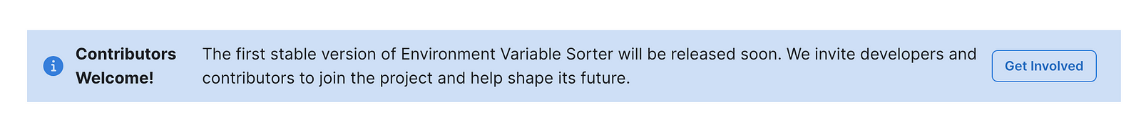
Building customizable banners is as easy as using the following components from Saas UI: Banner, BannerIcon, BannerContent, BannerTitle, BannerDescription, and BannerActions. With these components, you can fetch the desired announcement from your server and render it without the need to write custom CSS styles.
Saas UI provides numerous customization options for banners, including the ability to set the status, add custom icons, and make the banners clickable. To explore the full range of customization possibilities and learn how to use banners in Saas UI, refer to the documentation.
Implementing Progress Bars
Progress bars are specifically designed to provide feedback when pages are switching or when content is loading in the background.
Saas UI offers a convenient component called NProgress, which serves a similar purpose as the gatsby-plugin-progress in Gatsby, but is easier and more intuitive to implement.
NProgress can be particularly useful in single-page applications (SPAs) to visually indicate to users that something is happening while browsing. This is especially helpful when a page isn't preloaded and may take a moment to load.
Here are a few examples of how you can incorporate progress bars into your application using the NProgress component from Saas UI.
function ProgressBar() {
  return (
    <Box position="relative" overflow="hidden" height="10px">
      <NProgress isAnimating position="absolute" />
    </Box>
  );
}
The isAnimating prop is used to control the animation of the progress bar. Setting it to false completes and dismisses the animation, while setting it to true allows the animation to continue progressively. Additionally, you can specify various customization options such as the position and colour scheme.
Here is an example of how you can customise the progress bar from Saas UI:
import { Box, Button } from "@chakra-ui/react";
import { NProgress } from "@saas-ui/react";

export default function Example() {
  const [isAnimating, setAnimating] = useState(false);
  return (
    <div>
      <Box>
        <Button onClick={() => setAnimating(!isAnimating)}>
          Toggle progress
        </Button>
      </Box>
      <Box position="relative" overflow="hidden" height="10px">
        <NProgress
          isAnimating={isAnimating}
          colorScheme="teal"
          position="absolute"
        />
      </Box>
    </div>
  );
}
The toggle process for the progress bar can be triggered from anywhere within your application, such as when dynamically loading content or navigating to a different page.
If you are using Next.js and would like to automatically show the progress bar when navigating between pages, there is no need to handle it manually. Saas UI offers a helpful component that can be used in conjunction with the Next.js router called NProgressNextRouter. Here is an example of how you can use it using the older Next.js approach:
import { useRouter } from "next/router";
import { NProgressNextRouter } from "@saas-ui/react";

function App({ Component, pageProps }) {
  const router = useRouter();
  return (
    <>
      <NProgressNextRouter router={router} />
      <Component {...pageProps} />
    </>
  );
}
Implementing Snackbars
Snackbars are commonly used in SaaS apps to deliver feedback, notifications, and alerts to users. They typically consist of a small UI component with concise text content. A robust snackbar should offer various customization options to cater to different needs within an application.
Here are some typical use cases for snackbars in a SaaS app:
- User Feedback: Enable users to provide feedback or suggestions through a snackbar component.
- Action Confirmation: Prompt users to confirm an action or decision through a snackbar. For instance, when deleting an item or executing a critical operation, the snackbar can display a confirmation message with "Undo" or "Cancel" options.
- Progress Updates: Display progress updates to users, keeping them informed about the status of an ongoing task.
- Offline or Connectivity Alerts: Notify users about their offline status or connectivity issues through a snackbar.
- Informational Messages: Convey important information or announcements to users through snackbars.
Saas UI simplifies the process of integrating snackbars into your SaaS app, offering an array of customization options.
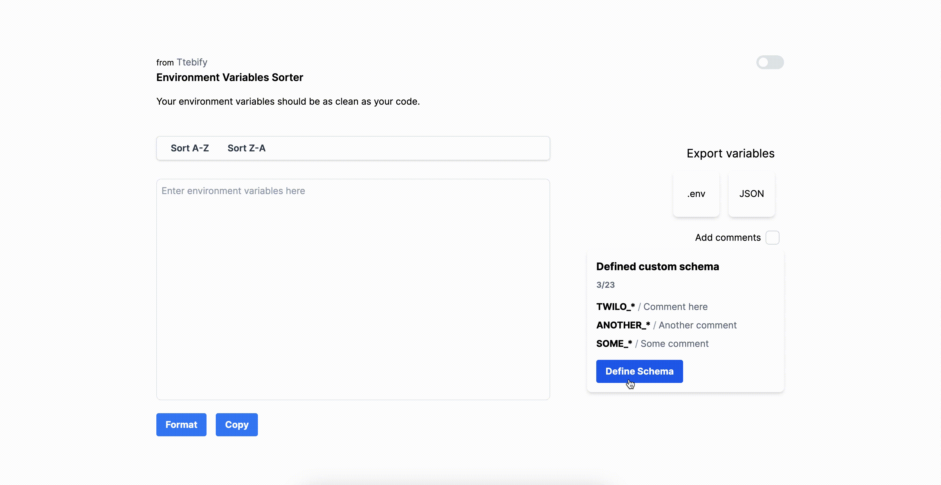
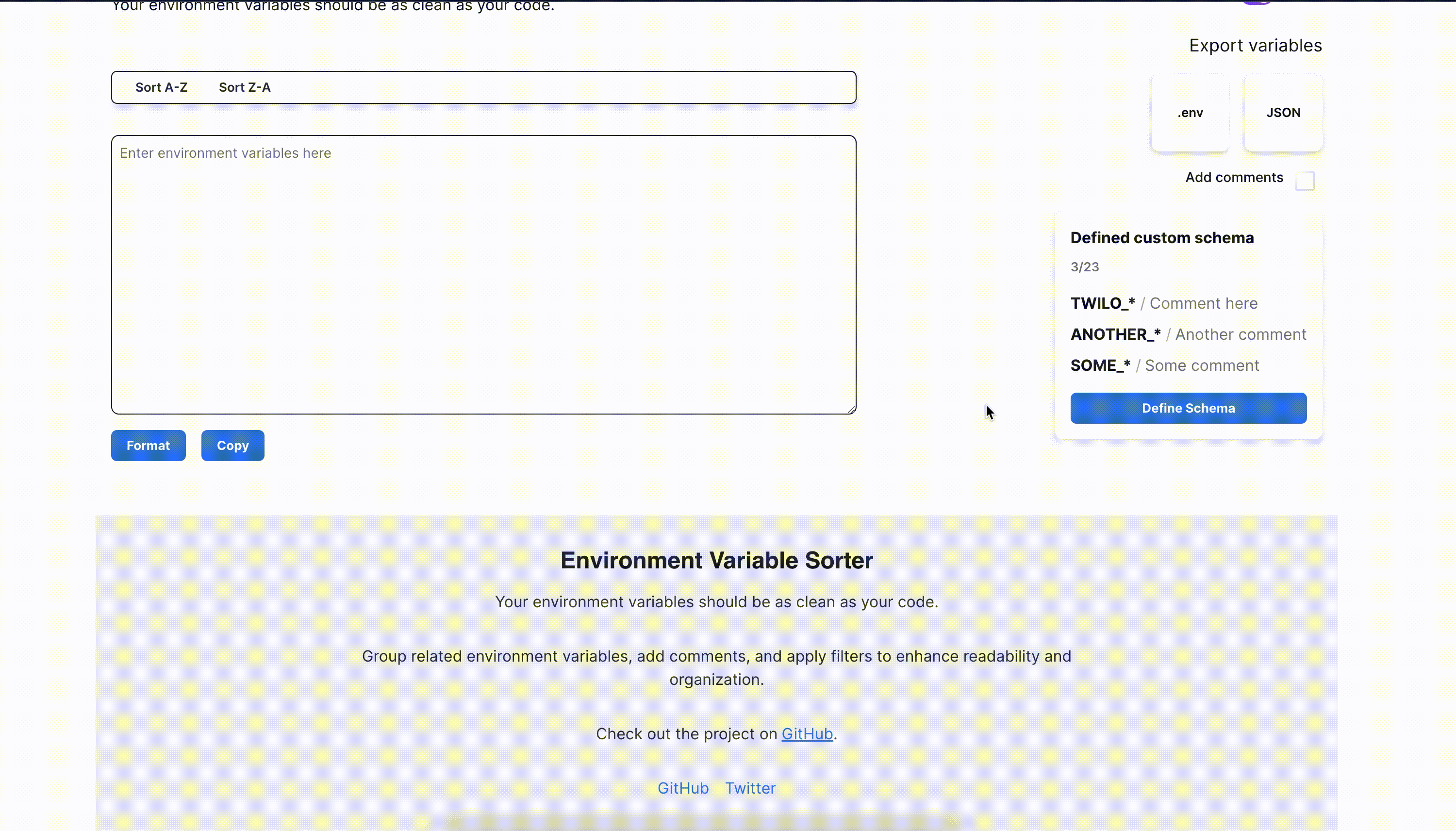
In the Env Sorter project, we will demonstrate how to display a snackbar when one of the export variable buttons is pressed.
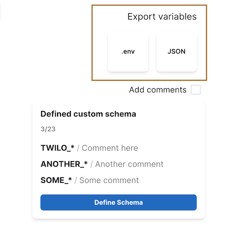
Highlighted export buttons in the Env Sorter project.
The component we will be working with is located in the components/RightSideBar.tsx file. To begin, we will rewrite it using Chakra UI components. Please note that I have extracted only the relevant portion for our purpose, while the remaining parts of the code can be found on GitHub.
import React, { Fragment } from "react";
import { Button, Flex, Text } from "@chakra-ui/react";

function RightSideBar() {
  return (
    <Fragment>
      <Flex
        flex="1"
        marginLeft={64}
        flexDirection="column"
        w="full"
        alignItems="flex-end"
      >
        <Flex flexDirection="column" alignItems="flex-end">
          <Text fontSize="xl" mb="4">
            Export variables
          </Text>
          <Flex gap="4">
            <Button
              flex="1"
              w="20"
              h="20"
              bg="white"
              _hover={{ bg: "gray.100" }}
              shadow="md"
              rounded="lg"
              py="2"
              px="4"
              transition="duration.300"
            >
              .env
            </Button>
            <Button
              flex="1"
              w="20"
              h="20"
              bg="white"
              _hover={{ bg: "gray.100" }}
              shadow="md"
              rounded="lg"
              py="2"
              px="4"
              transition="duration.300"
            >
              JSON
            </Button>
          </Flex>
        </Flex>
      </Flex>
    </Fragment>
  );
}
At this stage, we are simply focusing on creating a visually appealing UI using Chakra UI. Now, let's move on to creating a function that we will call handleExportVariable:
const handleExportvariable = () => {};
Saas UI provides two convenient methods for creating snackbars, useSnackbar hook and createStandAloneSnackbar
- Using the
useSnackbarhook: This is a helpful wrapper around theuseToasthook in Chakra UI, offering additional features such as:
- Convenience methods and
- Support for an action button.
Convenience methods: These methods are designed to simplify the creation of various types of snackbars based on your specific use cases.
Here are some examples:
import { Button } from "@chakra-ui/react";
import { useSnackbar } from "@saas-ui/react";

export default function SnackbarExample() {
  const snackbar = useSnackbar();

// Convinience methods:
 // 1. Success
 const showSuccess = () => snackbar.success("Your account has been created.");
 // 2. Error
 const showError = () => snackbar.error("Your account couldn't be created.");
 // 3. Info
 const showInfo = () => snackbar.info("Your account has been created.");
 // 4. Chain multiple actions together
 const showChainedActions = () => {
 snackbar.promise(new Promise((resolve) => setTimeout(resolve, 10000)), {
 loading: "Creating your account...",
 success: "Your account has been created.",
 error: "Your account couldn't be created.",
 });
 };

return (

{" "}

<div>
  <Button onClick={showInfo}>Show Info</Button>
  <Button onClick={showSuccess}>Show Success</Button>
  <Button onClick={showError}>Show Error</Button>
  <Button onClick={showChainedActions}>Show Promise</Button>
</div>
 ); }
I find the snackbar.promise feature quite useful, as it allows us to chain multiple actions together. This is exactly what we will be implementing. When the export variable button is pressed, it should take some time to process and format the variables based on the applied filters, defined comment schema, and chosen programming language. Afterward, the file types will be generated.
Here is an outline of what our function will look like:
const snackbar = useSnackbar();

const handleExportClick = (format: string) => {
 snackbar.promise(
 new Promise<void>((resolve, reject) => {
 exportVariables(format)
 .then(resolve)
 .catch((error) => {
 reject(error);
 });
 }),
 {
 loading: `Exporting ${format} variables...`,
 success: `Exported ${format} variables successfully.`,
 error: (error) =>
 `Failed to export ${format} variables: ${error.message}`,
 }
 );
 };

const exportVariables = (format: string) => {
 // Simulate the export process
 return new Promise<void>((resolve, reject) => {
 // Perform the export operation here
 setTimeout(() => {
 resolve();
 // reject(new Error("Export failed")); // Uncomment to simulate a failed export
 }, 2000);
 });
 };
In the updated code, the handleExportClick function invokes exportVariables within the Promise constructor. The export process, including the asynchronous operation with a timeout of 2 seconds, is simulated within the exportVariables function. The promise is resolved or rejected based on the result of the export process.
By resolving the promise after the export process is complete, the snackbar will display a loading state until the export is finished. Any errors thrown during the export process will be caught by the snackbar's error handler.
This implementation ensures that the snackbar accurately reflects the progress and outcome of the export process, taking into account the asynchronous nature of the operation and the timeout.
Here is a GIF that provides a visual demonstration of the functionality:

Simple Saas UI success snackbar
To provide further customization options, we can adjust the position of the snackbar and make other modifications as required.
Here is the updated version of our handleExportClick function:
const handleExportClick = (format: string) => {
 const position: ToastPosition = "bottom-right";

    snackbar.promise(
      new Promise<void>((resolve, reject) => {
        exportVariables(format)
          .then(resolve)
          .catch((error) => {
            reject(error);
          });
      }),
      {
        loading: {
          title: `Exporting ${format} variables...`,
          position,
        },
        success: {
          title: `Exported ${format} variables successfully.`,
          position,
          isClosable: true,
        },
        error: (error) => ({
          title: `Failed to export ${format} variables: ${error.message}`,
          position,
          action: <Button variant="subtle">Retry</Button>,
        }),
      }
    );

};
In this revised code, we have made some modifications. We specified the position of the snackbar, and for the success toast, we added the ability to dismiss it by including the isClosable option. Additionally, when errors occur during the export process, we include a retry button in the snackbar.
Here is an illustration of how they appear:

Beautiful Saas UI success snackbar with closable button.

Beautiful Saas UI error snackbar with retry button.
If desired, we can even apply custom styles to the snackbar container. Here's an example of how it can be achieved for a component called Example:
import { Button } from "@chakra-ui/react";
import { useSnackbar } from "@saas-ui/react";

export default function Example() {
  // Via instantiation
  const snackbar = useSnackbar({
    position: "top",
    title: "Container style is updated",
    containerStyle: {
      width: "800px",
      maxWidth: "100%",
    },
  });
  // Or via trigger
  // Style here will overwrite the entire style above
  return (
    <Button
      onClick={() => {
        snackbar({
          containerStyle: {
            border: "20px solid red",
          },
        });
      }}
    >
      Click me to show snackbar with custom container style.
    </Button>
  );
}
Saas UI simplifies the process of creating visually appealing and effective feedback using snackbars. It provides a delightful experience for incorporating snackbars into your application.
For more detailed information and guidance on using snackbars in Saas UI, I highly recommend referring to the SaaS UI documentation.
Implementing loading spinners
Loading spinners play a vital role in enhancing visual feedback within your app. They provide a visual indication to users that a process is being loaded in the background, reducing uncertainty and improving user experience.
In this section, we will explore how to implement loading spinners effectively by incorporating a pre-built loading spinner component from Saas UI:
When users click on the Format button, we want to display a spinner that overlays the textarea with transparency. This prevents users from editing the text content while the formatting process is running in the background.
To achieve this in the EnvironmentVariableEditor component, we will make the following update:
function EnvironmentVariableEditor() {
  const [formating, setFormating] = useState(false);
  useEffect(() => {
    if (formating) {
      setTimeout(() => {
        setFormating(false);
      }, 1000);
    }
  }, [formating]);

  return (
    <Box position="relative">
      <Textarea
        width="full"
        height="calc(100vh - 200px)"
        maxH="72"
        mt="8"
        border="1px"
        focusBorderColor="blue.500"
        rounded="lg"
        p="2"
        mb="4"
        placeholder="Enter environment variables here"
        value={rawEnvVariables}
        onChange={handleEnvVariablesChange}
      />
      <LoadingOverlay variant="overlay" isLoading={formating}>
        <LoadingSpinner size="lg" color="blue.500" thickness="4px" />
      </LoadingOverlay>
    </Box>
  );
}
Notice how we wrapped the Textarea and LoadingOverlay components with a Box component from Chakra UI. We gave the parent wrapper a position of relative, which allows us to position the LoadingOverlay component inside it. The LoadingOverlay automatically fills the parent container and centres its content.
With Saas UI Loading Overlays, you have more customization options available. For example, you can change the size and appearance of the spinner. Here's an example of how we have customised the spinner in the LoadingOverlay component:
<LoadingSpinner size="lg" color="blue.500" thickness="4px" />
We could also easily make more modifications, such as using a custom logo as the load spinner, among other things. Saas UI is awesome.
Final GIF demo of working project
Conclusion
In conclusion, this tutorial has provided valuable insights into the importance of visual feedback in SaaS applications and how to leverage Saas UI for creating engaging user experiences. We have explored various visual feedback components such as:
- Banners
- Progress bars
- Snackbars and
- Loading spinners
and learned how they can enhance the overall quality of a SaaS app.
One of the notable advantages of using Saas UI is its ease of setup, and the out-of-the-box responsiveness and rich accessibility features have been particularly impressive. Its core offering also includes:
- A wide range of beautifully crafted components that are designed for data-heavy SaaS applications - tables, forms, data grids, and more, all using battle-tested React libraries such as React Table and React Hook Form.
- A flexible and customizable theming system that allows you to create a unique look and feel for your application, especially with design tokens.
- A comprehensive documentation library that includes tutorials, code examples, and API references.
- Accessibility treated as a first-class citizen, all components WAI-ARIA compliant out of the box.
If you've enjoyed this article, following me on Medium will keep you updated on future articles covering similar topics. Let's continue our journey of making the world a better place, one line of code at a time.
To know more about Saas UI, check out its core component offering here.
Comments
Loading comments…