
My Journey
My codebase has over 50 different components for input, layout, navigation, and presentation. Each of these components has many different props to control dozens of variations and capabilities. With so many possibilities, it was difficult to keep track and remember all the functionality.
For me though, it wasn’t too big of an issue since I developed them. But new contributors did not have this background and experience, and as a result, struggled to learn the component library. They would have to either read through component code or look through actual usages of them in product code to understand it. Either way, it wasn’t a very developer-friendly experience. It became clear that some form of documentation around the component library was necessary. That’s where Storybook came in.
Storybook
Storybook is a tool to develop, demonstrate, and document a component library. It’s made of individual stories, each showcasing a specific component by providing a rich playground to visualize and interact with. Through this, users can learn how a component works and how it is controlled. These stories effectively become documentation in code.
These demonstration and documentation capabilities of Storybook can also be used for component development. Storybook provides an isolated development environment perfect for creating generic components. The playground it provides can be used to rapidly test new components in different scenarios for fast iterative development.
Storybook Playground
As mentioned, Storybook is more than just be a static showcase of stories. It is also an interactive playground for users to dynamically change the component and its environment to see how it will look like and behave in different scenarios.
Actions allow you to pass mock functions into your component which will log and display the input data in the actions tab when called so you can understand how the functions work.
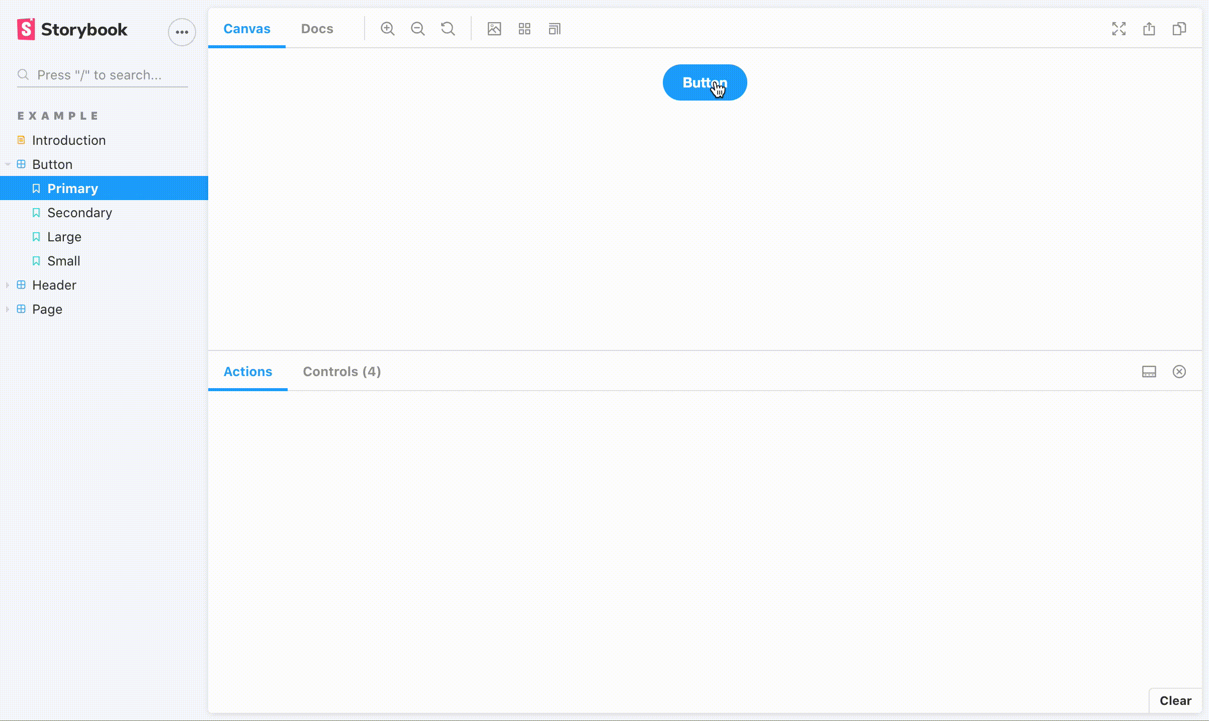 Storybook Actions
Backgrounds allow you to change the story background so you can see how the component will look like in different color environments.
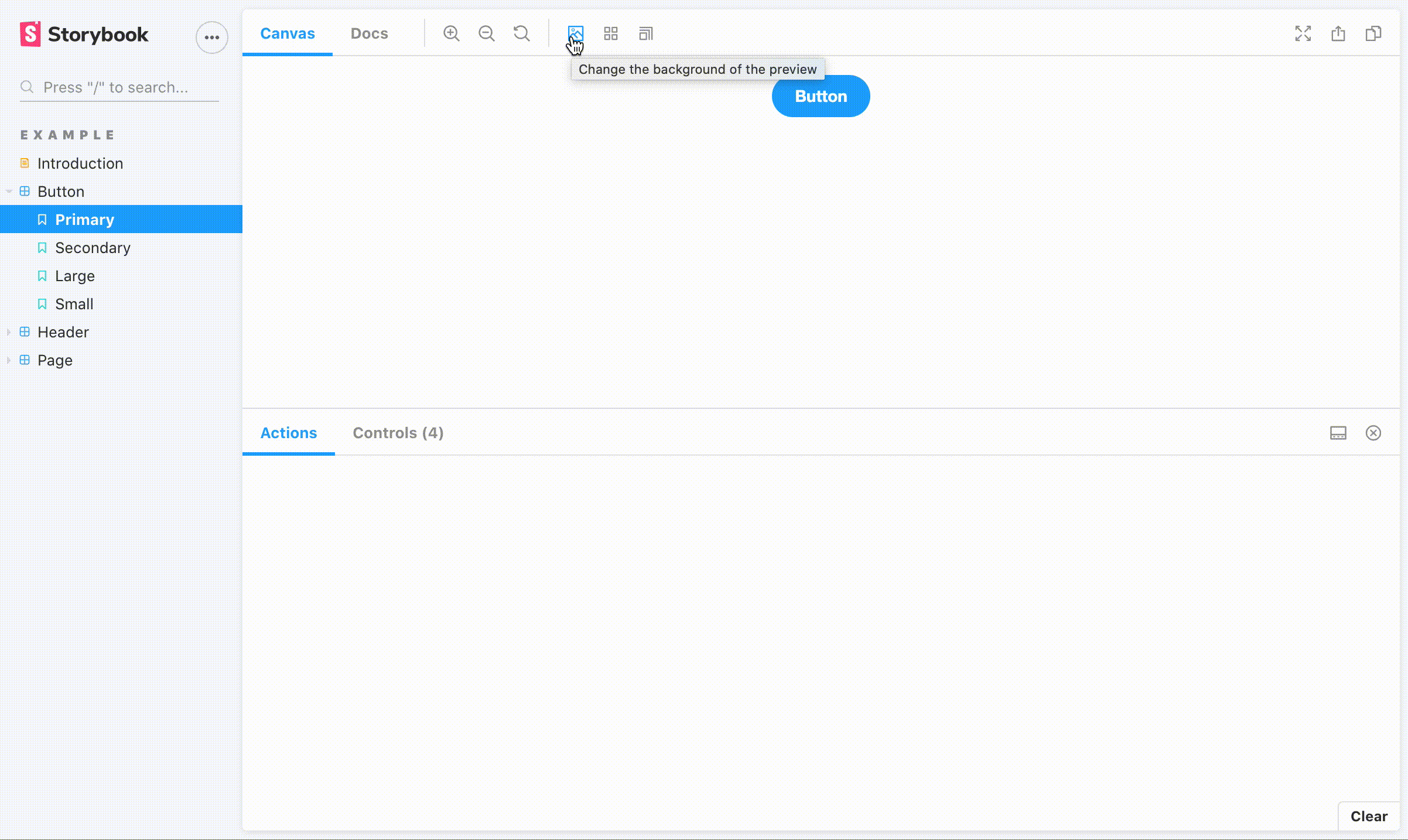 Storybook Background Controls
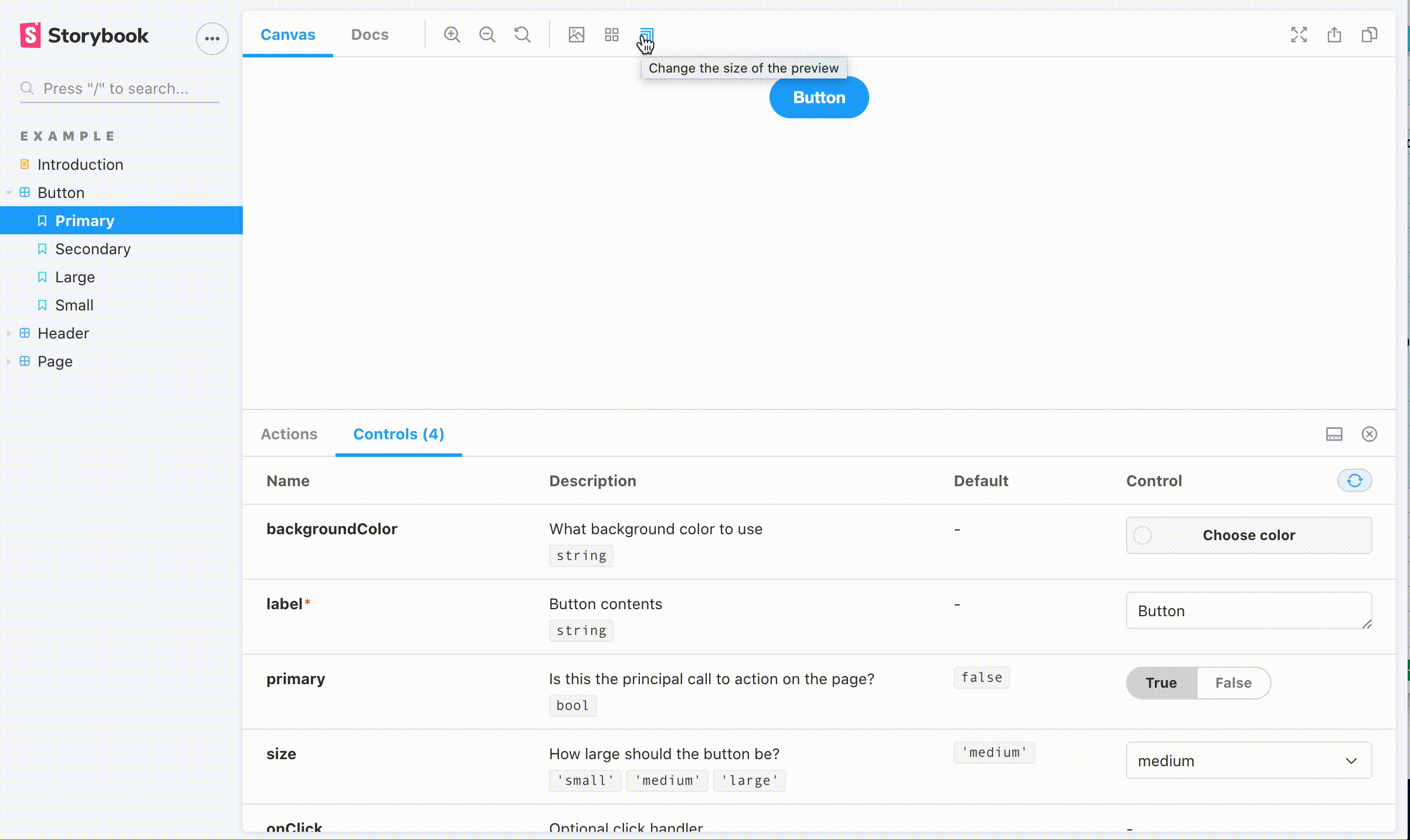
Controls allow you to dynamically change the component’s props in the UI directly based on the component’s defined propTypes so you can understand how the props affect the component.
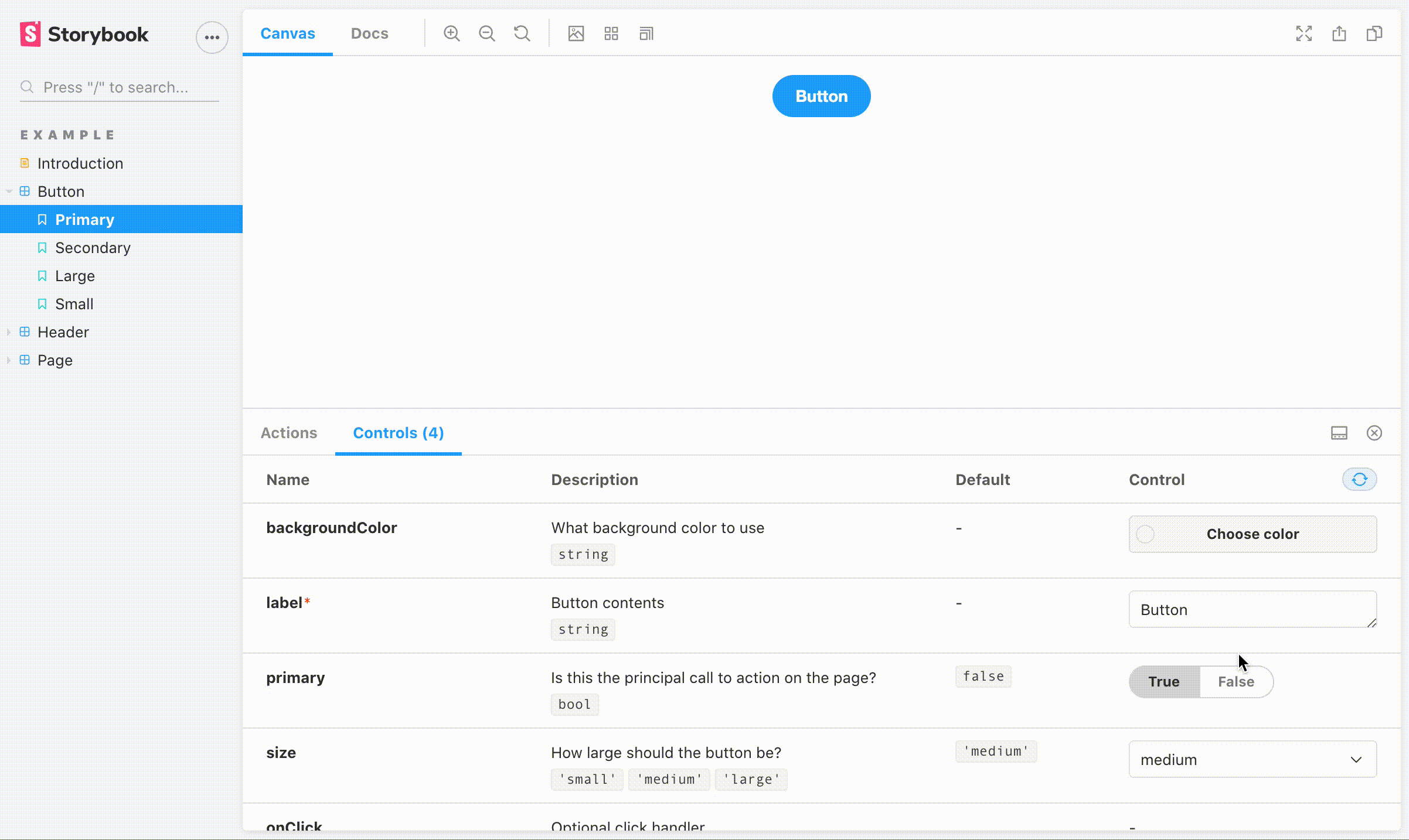 Storybook Component Controls
Docs automatically generates documentation for your stories that includes prop tables, source code, and markdown documentation all in a single view.
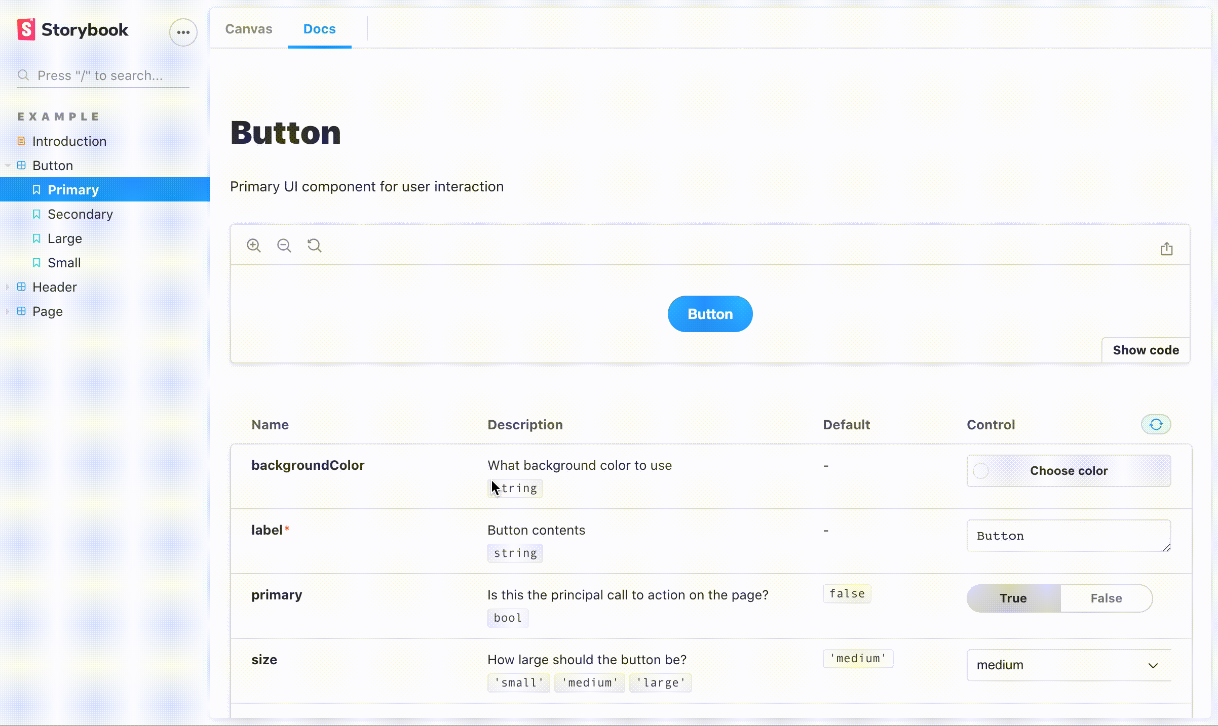 Storybook Docs
Viewport allows you to change the viewport so you can see how the component behaves in different screen size environments.
 Storybook Viewport Controls
Storybook Setup
To start, Storybook provides a handy setup tool: npx storybook init. This will
-
Install Storybook and all the necessary dependencies
-
Add storybook and build-storybook commands to package.json that will run Storybook in development mode and build Storybook for production respectively
-
Create a .storybook folder that includes the configuration needed to run storybook
-
Create a stories folder where all your stories will exist
Story Setup
Stories live in files that end in .stories.js. Each of these is a collection of stories for a given component. The setup for the component’s stories is done through the default export.
// Button.stories.js
import { Button } from './Button';

export default {
  title: 'Example/Button',
  component: Button,
  argTypes: {
    backgroundColor: { control: 'color' },
  },
  args: {
    label: 'Button',
  },
  parameters: {
    controls: {
      expanded: true,
    },
  },
  decorators: [
    story => (
      <div style={{ display: 'flex', justifyContent: 'center' }}>
        {story()}
      </div>
    ),
  ],
};
**Title **defines the title of the component stories and what section it should belong to. The title for this component story is Button, and it is in the Example section. This title must be unique across your Storybook.
Component is an optional configuration where you simply pass the component itself. Storybook will use this component to automatically generate a props table and create controls to dynamically control props based on the component’s propTypes and defaultProps.
**ArgTypes **is an optional configuration that defines prop table contents. Most of the time, this is not necessary since your Storybook can automatically generate them by using the above component field, but sometimes manual intervention is needed. In this example, backgroundColor must be a color but the propType defined for this is PropType.string which Storybook will interpret as a free form text input control. By manually setting the control to color, backgroundColor can now be controlled through a color wheel.
Args is an optional configuration that defines the props that all stories for the component will have so you don’t need to define the prop over and over again for individual stories.
Parameters is an optional configuration that is used to configure Storybook features. In this example, Controls has an expanded property that when set to set to true using parameters, will expand the prop table to show the description and default prop columns.
Decorators is an optional configuration that will wrap each story with additional JSX. In this example, the decorator will center each story. This is especially useful when your component needs to be wrapped in some context such as React Router or React Redux.
Story Content
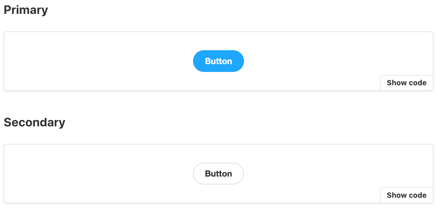
Story content is created through named exports. Each named export would render a variation or capability of a component.
// Button.stories.js
import { Button } from './Button';

const Template = args => <Button {...args} />;

export const Primary = Template.bind({});
Primary.args = {
  primary: true,
};

export const Large = Template.bind({});
Large.args = {
  size: 'large',
};
 Story Content
Template is an abstraction layer that defines how the component is rendered. Each named export creates a copy of this template using bind and defines the props for the story through args. Storybook will take these and showcase the stories with the export name as the title. And voilà you have your stories!
Now before you ask, yes some of this does seem unnecessary especially for React but Storybook supports other Javascript frameworks such as Vue and Angular where the benefits of this coding pattern is much more obvious.
Final Thoughts
Storybook has tremendously benefited me and my team. It enables developers to rapidly develop and test new components in different scenarios through dynamic UI controls. It enables developers to showcase and document all the features of their component library all in one place. It enables users to quickly learn the features of a component library in a simple, yet powerful, interactive playground. Simply put, Storybook is a must have tool for any comprehensive component library.
Comments
Loading comments…